In all forms of design, the headline is the hook. It’s the first thing people notice about your content, and it affects whether or not they’ll want to keep reading. Because of this, bold serif font for headlines should leave a powerful impression, whether it is beautiful, sophisticated, charming, or mysterious in nature. To peak the reader’s attention and compel them to continue reading, many media, such as newspapers, magazines, blogs, and posters, make extensive use of headlines. Consequently, it will be necessary to choose the best bold serif fonts to make the material look more urgent, crucial, and above all, worth the reader’s time
Headline typefaces may be taken lightly by certain readers. Even though a headline is only one line long, it still has to be arranged properly in order to be read by the general audience. Use a typeface that is legible and readable while you’re writing headlines. Make sure your headline is at the top of the list when it comes to the hierarchy. Some thick fonts can be used as-is. However, in other circumstances, you may need to use a strong typeface to draw attention to a specific word or phrase.
It’s time to choose a strong serif font now that you realize how vital it is. There is no need to waste time looking for a suitable bold serif font because we have already done the hard work for you. Fonts for posters, flyers, media platforms, and website posts may all be found in this collection.
Print and online designers are still debating what defines a good typeface for a certain design. When it comes to typefaces, there’s a simple question: serif or sans serif?
If you’re new to typography, it might be tough to figure out what sort of “Serif” a font is. As a designer, you’ll grasp everything, but people who’ve not researched or worked in the field may find it difficult to comprehend.
Thank you for reading this post, don't forget to subscribe!
In a design, the typeface that is used has a direct impact on the user’s ability to read, comprehend, and enjoy the content. No matter how well-versed you are in fonts, you may still get yourself caught up in the serif vs. sans-serif dispute. Serif and sans-serif typography is a great place to start, especially if you plan to produce headlines or work in the professional typography field.
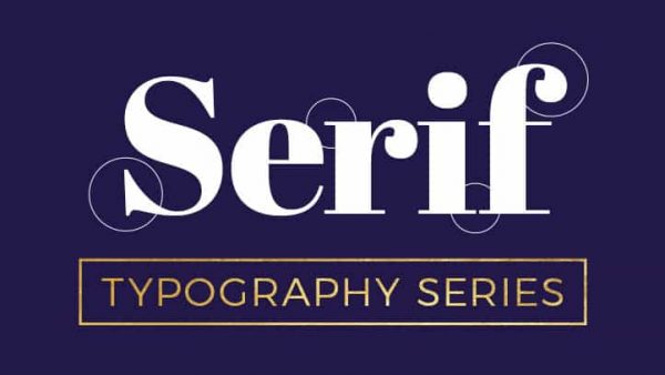
Before we can develop a Serif typeface, we must first establish what a Serif is. It is the thin lines that unite the ends of font strokes called serifs. The Latin alphabet is said to be their ancestor since they used it to chisel their letters into stone.
The origin of this ornamental typographic characteristic is unknown, however, it is usually thought that the Romans painted letters on stone with outlines that flared out at the edges, giving a boost to serifs. Transitional, Didone, old-style, as well as slab serif, are all subclasses of Serif Font.
As a result, serif typefaces have a more polished appearance and a more distinctive personality than their sans-serif counterparts.
Serif typefaces are particularly easy to read because of the large block of text they include. As a consequence, the readability of the design is enhanced. Fonts with serifs are commonly used in the headlines of numerous newspapers and magazines. These typefaces enhance the vision and concept of design, which is why they like to employ them. Sharp angles make serif fonts better suited to digital displays, which include all forms of screens.
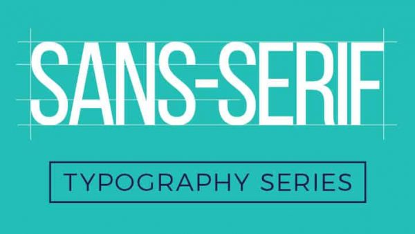
In 1805, sans-serif typefaces were first used in print. They were famous in marketing and display due to their cleanliness and intelligibility, no matter how big or small they were printed to be.
Sans-serif fonts have overtaken serif fonts as the most popular choice for displaying text on computer screens due to their ability to recreate delicate serif qualities in small letters.
This type of typeface is noted for its unusual and attractive design. Many site designers choose this font family over Serif Font. Compared to serif typefaces, sans serif fonts seem cleaner in print. They can be used on pamphlets and business cards because of their small weight.

Here are three top reasons why understanding fonts, including the difference of serif and sans serif, matters for your design.
According to a thorough study of fonts, people’s minds are better able to build associations when a certain font is used. As a brand, it helps to use certain fonts in your messages and artwork. Your brand will soon be associated with that typeface.
Establishing a hierarchy of information is among the most critical functions of fonts. In this way, the reader is better able to determine which part of the text is most important.
It comes in handy when the readers are looking for something in particular. It is possible for the reader to swiftly skim the text and get the information they need.
The clear separation of text is made possible by the use of a distinctive typeface. This blog post’s H2 subheadings, for example, make it clear how important each one is. A brief overview of the point is provided below (in smaller font size and in a different format).
This helps the reader decide which segments are more important and should be seen first.
The message’s mood is defined by the choice of typeface and font style. When used in conjunction with a typeface like Walt Disney Script, a positive mood is created. It’s hard to miss a serious undertone in The New York Times typeface.
The way a piece of writing is seen can be influenced by the font choices employed. When written in a lighthearted font, even serious topics like stealing lose their gravitas. On the other side, a somber and formal typeface on a promotional ad for a new video game system may not be as effective in conveying the intended message.
We’ll go right to the examples now that you’ve realized how important font selection is. Consider any of the following examples of strong serif fonts.

With London, a luxurious designer serif, you can create stunning and everlasting designs and logos. London’s thick-to-thin ratio and elegant lines make it ideal for logos, quotations, invites, marriages, letterheads, and more!
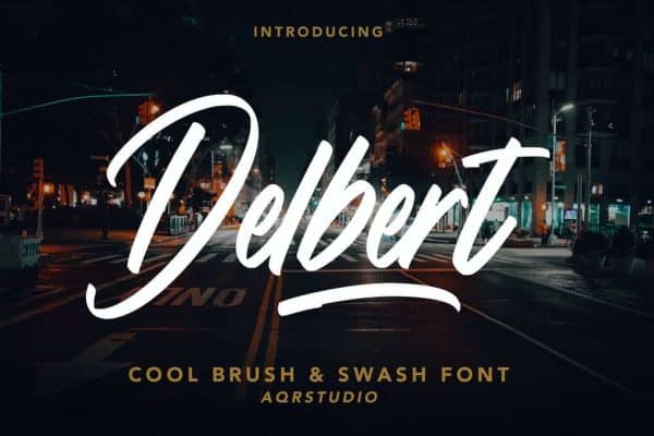
If you want to make a statement with your design, Delbert is a great choice for your headline. Delbert, on the other hand, is more in line with its modern equivalent, with its straight edges and broad lines, than other calligraphy fonts. To make a statement, mix it with a picturesque backdrop or slab the script on a simple background.
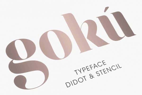
Originally conceived as a bold serif font for the Watches of Switzerland official launch, it is now a multilingual typeface comprising a wide variety of ligatures, glyphs, and alternatives that may be found here. It’s ideal for any project thanks to its strong angles, smooth curves, and enhanced readability.
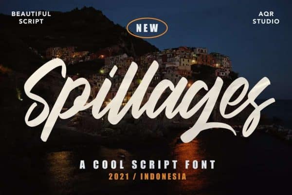
Bold serif font Spillages resembles fine calligraphy of the old period, and it appears to have been written by way of a thick marker. As a result, the style is ideal for anything from weddings and birthdays to branding and logo design to presentations and more.
In terms of customization, Spillages font is the greatest. Fonts with handwritten appearances make your design seem like it was penned by a lifelong friend just for you.
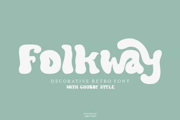
Using Folkway as a headline is one of the best ways to get people’s attention in a flash. This bold serif font may be used for posters, graphics, and t-shirts, among other things. To make a statement that is both cool and striking, but not overbearing, it is possible to use this technique.
Folkway, on the other hand, is an excellent choice if you’re seeking a unique typeface for your next creative project.
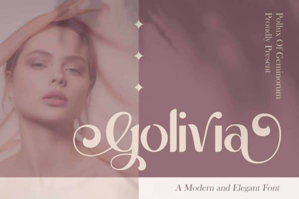
Elegant, high-contrast, strong serif font inspired by fashion glossy magazines’ type. In Golivia, you may find both modern and old styles in one. Alternate characters and attractive ligatures are included in the typeface.
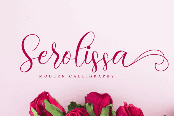
Elegant cursive shapes are left in their wake by blooming flowers, and that’s what inspired this bold serif font’s curvy design. This typeface is simple and straightforward, yet when paired with the correct color scheme, the Serolissa blooms into a memorable distinctive font that no other typeface can match.
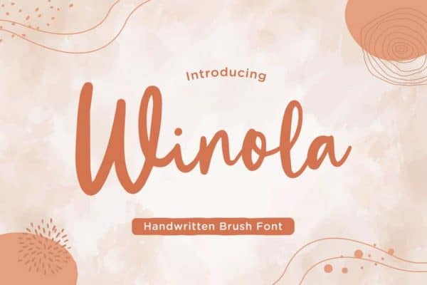
Winola is the perfect typeface for capturing the attention of your audience with its elegant, sophisticated strong serif style. Winola’s current brush styles seem real, and it gives your design a feeling of individuality and makes everything you do into a magnificent work of art.
Are you curious as to where you may use this font? For example, you may use it in a website design, an ad headline, or on social media. It’ll be just as amazing as it was before.
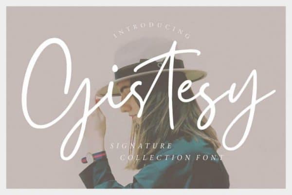
Looking for a beautiful, strong serif font with a casually down-to-earth look? The answer is Gistesy. Gistesy is a sensitive yet daring typeface that combines elegant curves with bold lines. Watermark, social networking, photography, and product design are just some of the many possible applications.
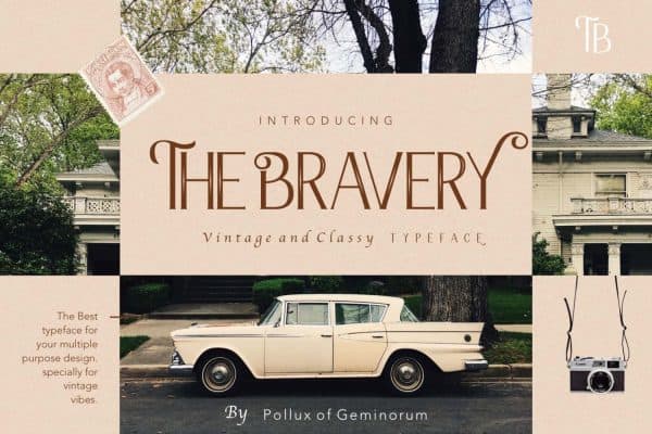
An eye-catching personal brand begins with the Bravery typeface. This one-of-a-kind is designed to draw attention to the unique aspects of your company or personal account!
Interested to try? The Bravery may be used with powerful hues like black, crimson, or grey to create a stunning effect.
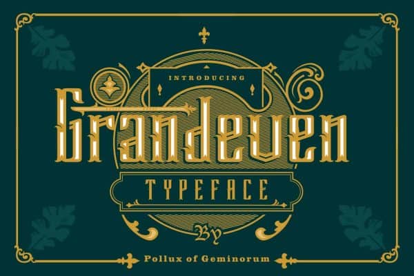
Surely the Grandeven typeface is a work of art. It has a refined appearance and feels thanks to the use of ligatures and stars. Modern and beautiful font lovers will love this typeface. Whether you’re working for a high-end company or are interested in the occult, this project is perfect for you.

Another elegant strong serif font is shown here. For logos, headings, and other text that has to grab the eye, a strong typeface like this one is a great choice. Such a distinctive and enjoyable visual style distinguishes this one.

The bold serif font Baguette has a playful style that sets it apart. With its handwritten appearance, Baguette is well-suited for designs such as posters and graphics, as well as any other project that needs the addition of a unique touch. Because of its on-screen optimization, it may be used on both a website and an app.
As a font, Baguette is a refreshingly clean and modern option. You may use it to create a design with a playful theme or to inject some life into a drab one.
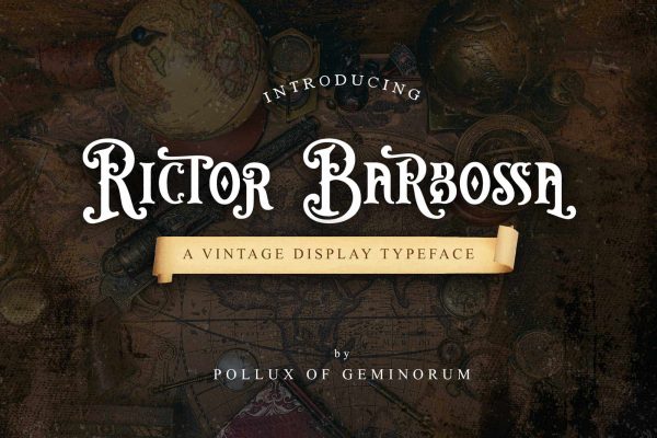
Surely this is a stylish bold serif typeface? An additional element of luxury is added to the overall design by way of lengthy, ornate flourishes When it comes to high-end items, big events, and festivities, the use of a bold and beautiful typeface is ideal.
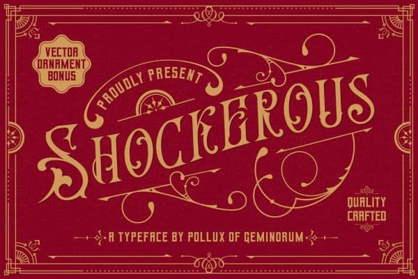
One more take on a traditional look, this time updated for the present day. A strong, hefty serif design and a wide range of applications make this typeface versatile. A contemporary look is enhanced by the angular edges.
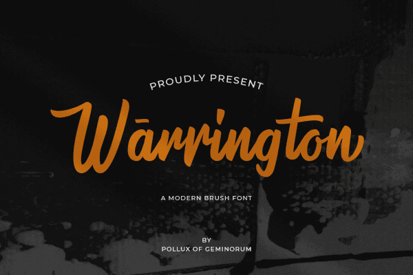
Like this font, bold serif fonts like this one can be used for a variety of purposes. Some of the capitals have a tiny bend to them. Despite its subtlety, it’s an aesthetically appealing piece. As a supplement, though, it’s just as good as the main course of action.

Aren’t these letters lovely? The combination of serifs and lovely flourishes creates a contemporary twist on a little retro style. This bold serif font will add refinement and refinement to your printed materials, packaging, and branding.

Your design project can benefit from the inclusion of fun and contemporary typefaces. Projects with an active vibe or those looking for an unconventional, decorative approach would love this one.
Bold serif fonts may be used in a variety of ways, ranging from elegant, fashionable, daring, and bold to more conservative. These hand-picked typefaces will undoubtedly assist you in attaining the next level of design for your project!