Brand logos reflect a company’s brand image – sometimes, it acts like a magnet that attracts all the objects around it. In any branding campaign, the logo plays a vital role in reflecting the quality of the service or a particular product being marketed.
Logo can grab the attention of the consumers and communicate the company’s core values. This way, consumers can judge your business’s appearance, providing added benefits for the general impression of your branding campaign.
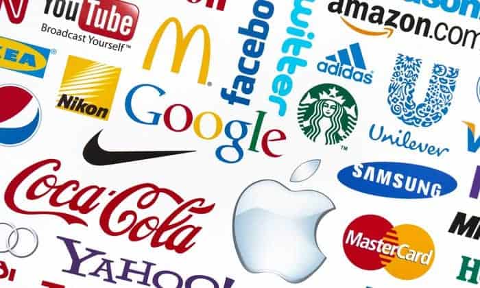
If you are trying to create brand logos for small businesses, these five inspiring logos might give you the necessary spark that lit up your creative brain.

Amazon is the largest online store in the world. Amazon Logo is designed to convey a vast directory of storage. This symbolism is hinted at by the arrows that connect the letters’ A’ to ‘Z’ – showing that the company has everything from ‘A’ to ‘Z’ to sell to everyone. Furthermore, the arrows also mimic the appearance of a smile, representing the customer’s joy while purchasing the product on Amazon.

Carrefour means “crossroads” in French. The color of the logo is also based on the color of the French flag. Such as simple and intelligent logo concepts. The red and blue arrows of the logo pointing in opposite directions. If you pay close attention, you will be able to see the hidden letter ‘C’ inserted through the use of negative space.
Thank you for reading this post, don't forget to subscribe!

Rob Yanov, the Apple logo designer, explained that he bought a sack of apples and tried to draw them for several weeks just to find the proper outline. After biting one of the apples, he was coincidentally inspired that the “bite” sounded similar to “byte” in computer terminology, a perfect match to represent the company specialized in technology.
Surprisingly, the reason why the apple in the logo is bitten is to distinguish it from cherries. The bite is only made to scale. Thus, the logo will always look like an apple instead of a cherry, even though it’s small.

The big yellow “M” in the McDonald logo might be the most popular typeface logo globally. Back in the ’60s, the company kept changing its logo until Louis Cheskin, a psychologist and design consultant, convinced the board of directors that the big yellow M shape should be preserved as the hallmark of their company.
Interestingly, many McDonald’s customers at that time described the logo as a bare woman “breast” and were attracted to the shape. Since then, McDonald’s logo has been retained and used in more than 30.000 McDonald’s branches worldwide.
Placing your brand’s logo in all aspects of the business will help the consumers recognizing the business, establish positive relationships with the target consumers, and attract new customers.
That being said, creating brand logos that are easy to remember is not an easy job. Poorly planned design can lead to consumer misperceptions. Therefore, it is imperative to take your time creating brand logos and take a close look at many big company’s logos to find the right inspiration for your work.

