Choosing the right font is half the battle. It means by choosing the correct font in your files like the Sans Serif fonts in your assignment tasks or presentations; you have done so much in making your works more readable to the audience. Out of all fonts out there, why should it be Sans Serif?
Well, there are several reasons why you should use Sans Serif more often. Why is it the case?

If you pay some attention for a few minutes, you will realize that major companies such as Google and Spotify utilize Sans Serif as the main font of their logos. There is a justified reason behind their decision.
Sans Serif itself defines and embodies progress and willingness to go forward. By making the logo sleek-looking, the companies want to show people that they are flexible and will always improve themselves for the sake of their consumers.
Although you can choose a particular font to create a logo or a final assignment, in the end, you must make all of them clean and crisp enough for the readers.
Thank you for reading this post, don't forget to subscribe!
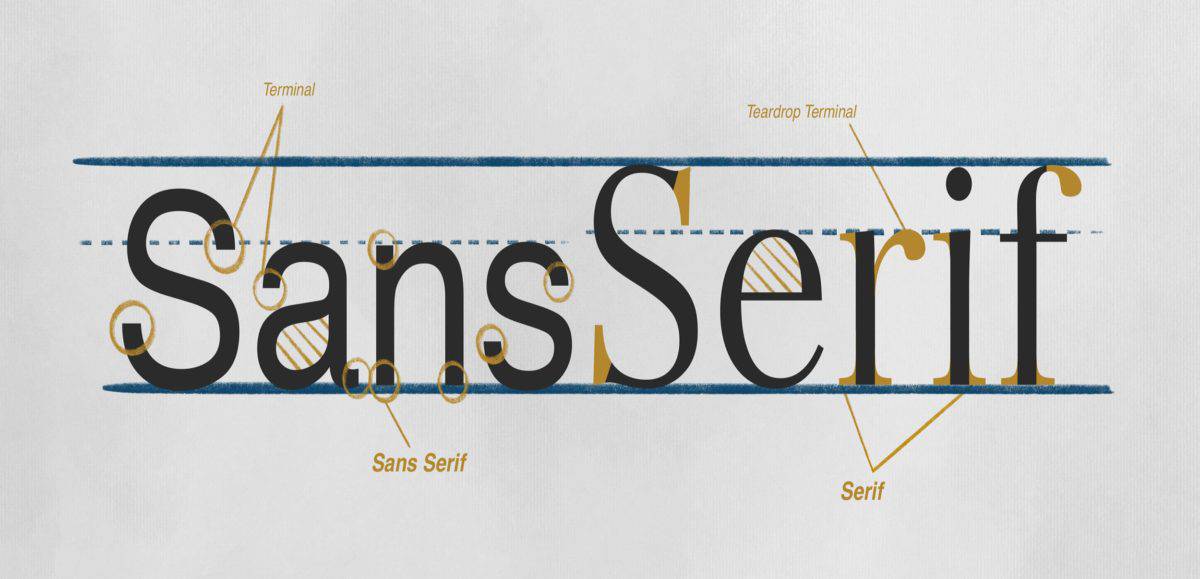
In this regard, Sans Serif prides itself on having clear and distinctive edges that make it comfortable to read them.
Apart from logos, this makes Sans Serif popular for other purposes, such as web designers who should make comfortable websites to improve the user experience.
To increase competitiveness in the modern era in which the market is saturated with modern-looking competitors, Sans Serif can always balance attractiveness and simplicity to appeal to consumers.
By emphasizing modernity in itself, Sans Serif fonts can present themselves as a millennial-friendly font that can be flexibly used anywhere and anytime while maintaining formality.
Since there are so many fonts out there, you need to keep in mind that the first thing you must do in choosing a font is to make sure that it is readable to everyone.
For that reason, Sans Serif has progressed considerably to make itself more and more readable to the modern audience.
Humanist Sans Serif, for instance, has more inter-character spacing in the font compared to the previous versions of Sans Serif, with the result of the font being more readable to many people.
Yet another reason behind the decision to use Sans Serif more than ever is the aura and feel of youth and relatability that it embodies in the modern era.
In this modern era, we should realize that the ones who consume major products are the millennials. To do that, we should promote things that look relatable to their needs and tastes.
From this reasoning, major companies worldwide use Sans Serif to make themselves relatable to the millennials and willing to cater to their consumption preferences.
Now, we have understood the reasons behind the drive to use Sans Serif fonts more and more for our own sake. Nevertheless, of course, fonts are not only about Sans Serif, after all. We at Pollux of Geminorum can provide you with dozens of professionally made fonts for your needs. Contact us now for more information!

