Enjoy 25% Off All Fonts. Use Coupon Code ENDYEAR25 before December 31, 2025.

Have you encountered a typeface so big when being in public places that you can’t just miss it? Or have you ever been welcomed by an extensive heading after casually clicking on a website? If you answered yes to those questions, you’ve already seen some popular examples of display fonts. The next question is this: what is a display font, and what is it used for? Get ready to find the answers here!

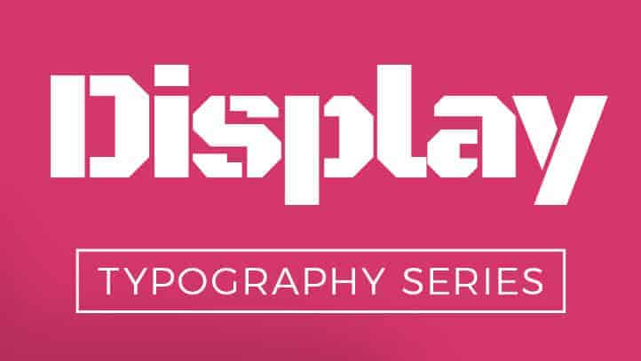
Display font refers to a collection of fonts that are commonly used at a large scale, whether as titles, headings, custom logos, or a focal part of editorial stories in printed and digital media. Also known as drop caps, these font types create instant, grandiose nuances in a design. They are usually used to highlight—or as the name suggests—to display the important elements that the audiences should notice at a glance.
The history of display font was closely linked to the rise of the Industrial Revolution, especially after the invention of printing and the press machine by Johannes Gutenberg in the 15th century. This initial discovery led to many developments in the printing industry. One notable milestone happened in the 1800s when lithography was invented, allowing people to print at a large scale and in various colors.
At that time, the lithography technique was used to print big-scale advertising signs and posters. Its main objective is to attract the public’s attention in larger spaces. Designers and publishers realized that they needed special, stretched characters that look good in big prints. The best solution is to use bolder and heavier typefaces that the modern publishing recognized as display fonts.
From its historical development, we know that display font is mainly used to grab people’s attention in large spaces. This function is discussed in the psychological perspective in a quite interesting way. The font is regarded as a typeface with individual values and distinctive features. It is not intended for longer reading; instead, it is a pictographic representation that displays the letters or characters in big pictures.
Display fonts can represent various meanings, but being shy and reserved is not one of them. The selected fonts should be fierce, strong, and different in their way—thus, they will successfully convey the messages and achieve their main goal to attract large audiences.
Here are some excellent choices of display font that you can use in graphic design:
That concludes some basic information about display font, including its history, psychological meaning, and some best options to be used in your design. When it is properly applied to any design project, this type of font can create a massive and powerful effect. To find more ideas of using display typography and other fonts in your design, be sure to check out this inspiring website.
Simply use the coupon code below and paste it on the checkout page.
Valid until the end of December 2025.