Enjoy 25% Off All Fonts. Use Coupon Code ENDYEAR25 before December 31, 2025.

There is something about larger and bolder fonts. They create an instant surprising factor even at first glance. They tend to deliver more clarity and readability of any intended message. That is why we increasingly see the bold font application in nearly every design area.
Read through this article to explore more about bold fonts, what benefits they offer, and how to use them successfully in design.

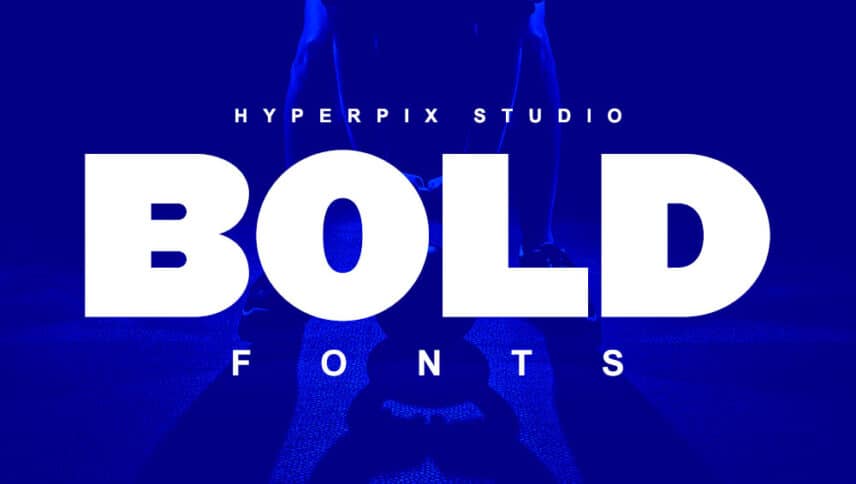
According to PCMag, bold font is “a set of type characters that are darker and heavier than normal.” It implies that bold fonts originally have heavier and darker appearances rather than designed on the fly from a normal-regular character.
This type of font goes by many names, such as simply bold, demi bold (or just demi), bold face, extra bold, or black and ultra. Bold typefaces indeed bring a darker text look with a thicker stroke weight.
The main use of a bold font in texts, print documents, or digital designs is to emphasize or clarify content, a remark, or a comment. It also establishes a typographic hierarchy to show the relative ranking or importance of any information.
You can also use bodacious fonts to draw the audience’s attention. This bold trend is not afraid to sound or look shouty. It has equal footing with other graphic elements or even shows domination in the whole sea of word composition.
Moreover, using bold fonts will help you, through your designs, in communicating confidence and certainty to targeted audiences, users, or customers. Remember, the bigger (and the bolder) the font, the clearer the message.
Now how can you use the bold font in design? The following are several inspiring answers to this question.
First, you can design websites or applications (apps) using it. Web design has been the first frontier of the bold typeface trend. The benefit is to create a quick, strong impression without the need for too many words.
Having a bold font, especially in the same weight lines, same shape, and the like, can create a more coherent and thoughtful logo design.
Bold fonts have been the dominant choice for designing posters. It relates to the point size, as readability for far distance is crucial. This leads to applying to business cards since a first impression is undoubtedly everything.
Having a bold font for your product packaging can deliver the message about what your brand identity is. The customers can tell directly what you want to offer. Also, the bold typefaces can help create a sense of authenticity and sincerity branding.
The late 2000s have witnessed the increasing appearance of bold font book cover designs. Dubbed as “big books,” they have leaped from the screen to the soft and hardcover page designs.
In addition to the perks of bold font, always keep in mind to use this type of font only when necessary or applicable. For example, you can have the bold version for text emphasis and the heavy version only for headlines. Visit online sources like Envato Elements, Creative Market, or Pollux of Geminorum for more creative bundles of bold fonts.