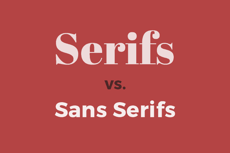
Speaking about fonts, there are many types of fonts out there. However, sans serif and serif are probably what you hear the most. Some of you may know the difference, but some may remain confused about when to use it. This article will help you to find the differences between both types of fonts and when is the right time to use each.

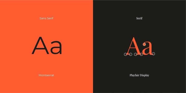
Sans-serif fonts are those without serifs at the ends of their letterings. They’re more modern and simple, and they’re famous for their excellent legibility. These fonts are more ordered and clean in look, with fewer frills. Sans serif font types include grotesque, neo-grotesque, humanist, and geometric.
Serif fonts include extra strokes on the endpoints of their letterings, which are called serifs. History, heritage, honesty, and integrity are all conveyed by these typefaces. The serif font genre encompasses a wide range of shapes, weights, and lengths. Serif fonts consist of several types, such as the old-style, transitional, and slab serif.
Many iconic typefaces and their accompanying fonts are classified as sans serif or serif. There may not appear to be much of a difference between serif and sans serif fonts on a first look. Still, a closer examination of the design model exposes a lot of significant variances.
You can define the differences by using three significant aspects: the style of strokes, vibes, and readability.
Thank you for reading this post, don't forget to subscribe!
Serif has decorative strokes that stretch beyond the edge of each letter. The decorative strokes are called serif, whereas sans serif font doesn’t have it. The most popular serif fonts are Times New Roman, Georgia, and Garamond. Meanwhile Futura, Helvetica, and Arial are among the best-known sans serif fonts.
Sans serif and serif are on the opposite poles when it comes to vibes. Serif typefaces are frequently thought to be more classic or formal, while sans-serif fonts are more minimalist or casual. Printed publications, such as books or newspapers, frequently employ serif typefaces, but digital publications and magazines use sans-serif fonts.
Some individuals believe that serif fonts are better for reading text at tiny sizes in printed media (such as books and newspapers). In contrast, sans-serif fonts are better to read in digital media. Most digital font readability has greatly improved over the years thanks to advancements in graphic resolutions and retina displays, making most people’s experiences a matter of personal taste and comfort.
It is not about which is better but rather depends on your message and the medium you use. Consider these three things when you decide whether to use sans serif or serif.
Think about what medium you will use, printed or digital? What will you create, a design logo or a long essay? Considering the target market is also essential, whether you meant it for children or adults.
Take a look at other similar works and study how easy and challenging they are to read. More than just font types, also consider colors for better readability.
It refers to the placement of the fonts and which ones are meant to catch the public’s eye. In this case, you may pair serif and sans serif in a design.
Now that you know the differences between sans serif and serif fonts, as well as what to consider when you are not sure what to choose. Find out more tips about using fonts, design tips, and awesome in Pollux of Geminorum.