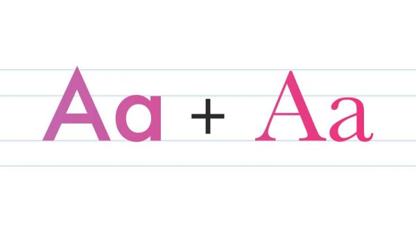
The use of fonts with similar styles results in good typography. The unexpected relationship of unrelated font combinations, on the other hand, can produce the best typography. Here are some tips for making typographic connections that will keep your designs exciting and inventive.

Do you need to pick two fonts in a short time? Try serif and sans serif. They complement each other well, especially when they are of different sizes.
It’s worth mentioning that there’s an argument over whether serif or sans-serif fonts are preferable for readability. Serif typefaces have a small line tied to the end of each stroke. They are intended to aid eye movement and boost reading speed in large amounts of text, particularly print.
On the other hand, sans serif font is a solid typeface with no small lines. This typeface appears more assertive, functional, and modern. Sans-serif fonts are commonly used for online/on-screen text because they simplify lettering and provide a more accurate display at various display resolutions.
When two visual elements in a design differ dramatically, it is considered a contrast. The serif and sans serif combos work well because it creates contrast. This contrasting idea manages to combine several concepts to consider, including hierarchical order as well as how fonts complement one another.
Thank you for reading this post, don't forget to subscribe!
The more the difference, the better the contrast. You can obtain contrast by:
Picking fonts with insufficient contrast because they are too similar will become an issue. You’ll have a hard time creating a hierarchy because the fonts are difficult to distinguish visually from one another. In addition, any discernible difference may appear to be an error rather than a deliberate decision.
Classification can be in the form of color, size, and typeface. Fonts classifications that are too similar will obscure the contrast. However, the fonts do not have to be identical to affect incompatibilities. Slightly different typefaces with equal weights, proportions, or letterforms can give your designs a confusing and unclear look, mainly when you use them at the same size.
Consider narrowing your options and limiting them to two or a maximum of three combos is preferable. One crucial bit of advice: keep it simple. Use classic serif and sans serif combos. The good news is that each typeface can generate up to eight fonts to work with: normal, italic, bold, and bold italic.
Last of all, here’s a bit of friendly advice instead of a rule: Experiment with fonts combinations on your own. Like any skill, you need a lot of trial and error and sometimes many headaches to become competent. The art of font pairing is often subjective, after all. No one has a foolproof formula for determining the ideal combination.
Want to experiment with different types of fascinating fonts? Pollux of Geminorum is all you need.