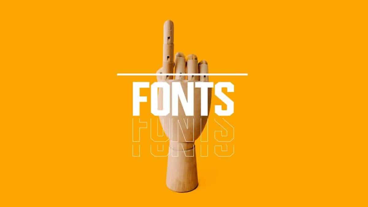
Every time we look at printed words, whether they’re on our cellphones, magazines, or websites, our brains are constantly digesting them. Instruction booklets and shops alike use fonts. Even though we often contemplate the impact of words on our lives, we don’t often think how the designer might use that same impact on the reader’s experience. Many individuals believe that typography is crucial, but what exactly are typography and font?
Designers are hard at work behind the scenes on every typeface, whether you can see them or not. Fonts may convey a variety of moods, feelings, and ideas, which is why it’s crucial to know how to pick the right one.
Whether you’re new to graphic design or a seasoned pro wanting to brush up on your skills, this quick tutorial will help you grasp the main concept of typography, learn the basic rules and frameworks, as well as pick the right font for your project.

Typography is the study and practice of arranging letters and symbols on a page. Besides font size, line spacing, and gap on a line or the entire page, the term also refers to certain other typographic characteristics. In order to draw attention to any product or service, typography creates a language that is easy to understand while also being aesthetically appealing.
Designers, creative directors, and novelists all use it in the creative industry to great effect. There has been an improvement in how letters are organized in the digital age, but the representation of texts by creative staff is still an issue.
Thank you for reading this post, don't forget to subscribe!

There can never be enough emphasis placed on the significance of typography when it comes to graphic design. The use of font improves readability, establishes hierarchy, and aids in the identification of a brand. Let’s take a look at how typography may help you reach your goals in graphic design.
The ideas and tones of a brand may be established with the help of a well-chosen typeface. Depending on what a company does and stands for, each typeface may represent them in a different manner. This is why typefaces come in such a wide variety of styles since they represent different feelings and impacts in a project.
The attention span of the average person has shrunk to only a few ticks. During this time of temporal friction, brands must catch the awareness among the target customers. In order to do this, graphic designers make use of typography’s attention-grabbing properties.
In graphic design, fonts are the visuals that potential customers or site visitors will recall for the longest time. These graphics help a business become well-known among its customers, thanks to their use.
If you’ve ever driven by a Nike billboard, you’ve probably seen the clear and sleek typeface and realized it symbolizes the Nike brand right away. This is a great illustration of typography’s impact.
Here are some fonts that create different tones and moods when used:
https://polluxofgeminorum.com/product/shockerous/
https://polluxofgeminorum.com/product/rasyideen/
https://polluxofgeminorum.com/product/the-bravery/
In a design, typography contributes to the creation of harmony and coherence. The creation of visual uniformity throughout all media is critical in brand identity design. Consistent use of header and fonts all through the site is what this looks like in terms of web design. Visual uniformity enhances brand awareness by giving an organization a polished and refined appearance.
Typography has the ability to make a powerful visual statement. Typography in visual communication may be used in a variety of inventive ways to leave an impact on the viewer. It may even be utilized to express a design’s idea without the need for any additional supporting graphics.

Getting yourself into typography can be quite daunting at first, but it doesn’t always have to be that way. Here are some principles of font that you ought to know to ease your learning process in the world of type.
Designers frequently make the blunder of using many typefaces in the same design. New designers are particularly prone to this. Each project should have no more than up to three fonts or styles, with one font for the subtitle, and another for the body text.
Black lettering on a white backdrop is the most popular typeface. Even while most people appreciate color, it may make reading difficult, boring, or even painful when seen for long periods of time. It’s virtually never a good idea to pick text and background colors that are diametrically opposed to one another.
There must be adequate contrast between the backdrop and the text for it to be legible. However, you must also ensure that the colors do not conflict.
A negative space, also known as white space, is an area that is devoid of any elements. White space is an excellent design element that may help you achieve your goals. It gives your font room to breathe while also helping to keep your design project’s various elements stable.
Typography relies heavily on proper alignment. Non-designers have a propensity to center-align all of their text when they write it themselves. However, center alignment is difficult on the eyes and makes it difficult for a reader to determine where a phrase begins and ends. This will have the effect of making folks entirely overlook your material.

Describe the feelings you want your viewers to get when they first come. A friendly environment is something you’d like to establish, right? The website should be pleasant, entertaining, or serious, depending on your preferences. The typeface must reflect the target segment exactly. When faced with this challenge, establishing the brand’s core characteristics and starting to acquire fonts that represent them are smart places to start.
For instance, can you tell what kind of personality each of these typefaces represents just by looking at them?
https://polluxofgeminorum.com/product/rebecca-clifton/
https://polluxofgeminorum.com/product/the-winchestera/
When choosing a typeface for your interface, how should you approach the process? Don’t stop till you’ve tested everything! Finding out what succeeds, what doesn’t, what’s readable, and what looks counterintuitive or clunky may be found by asking real people for input.
Even if a website looks great, it’s useless if it’s hard to understand and leads you to click on the wrong button or go in the wrong path because of ambiguous guidance. When choosing typefaces for your interface, put aesthetics and voice aside and focus on legibility, readability, and accessibility.
Choosing two typefaces that are diametrically opposed is one method of font selection. Use a large and strong serif font for the headline and a great classic serif font for the body text as an example of this. See how this tip works by looking at this example.
Which sector does your client work in? Is it one where customers could use an amount of confidence from your brand or web design? You may be developing a website for a cryptocurrency-related app, for example. Yes, they desire their potential customer’s trust, but they mostly would like to stand out, perhaps be a little more current and daring to attract their attention and praise.
Being aware of the design’s goal will help you make better font selections.
Tonal refers to the order in which words are used to create a message, whereas visual refers to the typeface and how it appears. Both of these aspects must work in unison and have mutual respect. By comparing a message’s visual appearance to what is written, you may determine what a typeface actually says. Since the aesthetic qualities of a typeface have an impact on how well a connection works, choosing the correct one for your project is critical.
Research and inspiration are critical components of the design process. The next typeface you are using for your design may be inspired by one of these amusing typefaces. For example, you can use Pinterest or Behance as sources.
The design of a typeface has an impact on how readable it is. To gauge how simple it is to tell one character over another in a font, this informal metric is used. It’s a way to gauge how simple it is to read the word, as well as how easy it is to read long passages of text. It’s all about making your type easy to read and enticing the reader to pick up the manuscript.
Fonts that are part families, or have a wide range of styles and weights to choose from, provide designers with additional design options.
Before selecting a typeface, keep in mind the project’s typographic requirements when making your selection. While two types of weights with bold and italics suffice for many projects, others may necessitate the use of extra weights in order to provide a clear visual hierarchy.
Using a variety of typefaces in a design contributes to the creation of visual variety. As a result, picking two typefaces that are visually identical is pointless. In fact, the much more similar two typefaces are, the greater the likelihood of a collision.
It’s time to choose a font now that you know how essential typography and the art of typeface are. Instead of wasting time searching for the perfect title font, you can relax knowing that we’ve already done the hard work for you. We’ve rounded together 7 of the best typefaces for use on anything from posters and flyers to social media and website posts.

Danny Brassco is a cursive script typeface that seems like it was written with a thick marker, evoking the elegance of bygone times. Weddings, birthday parties, branding, logos, displays, and a variety of other sorts of designs benefit greatly from this design’s fun and overtly edgy characteristics.
Of doubt, the most appealing feature of Danny Brassco typeface is the sense of uniqueness it conveys. Because the typeface appears to have been handmade, your artwork will feel as though it was created just for you by a friend.

Featuring a playful handwritten appearance, Lassona Martinez is indeed a unique headline font. With its handwritten appearance, Baguette’s font style works well for designs such as posters, illustrations, and anything else that needs a personal touch.
When used correctly, Lassona Martinez is a delightfully crisp and elegant typeface. You may use it to create a design with a lively theme or to breathe new life into a drab one.

For a bold font that grabs attention right away, choose Rebecca Clifton, one of the most thrilling cool typeface alternatives. This font is perfect for a wide range of projects, such as posters, graphics, and t-shirts. Use it to make statements that are cool and stunning, but don’t come off as blatant.

Boldejack is a handwriting font that’s perfect for creating a strong branding design or for use in a stylish headline. Boldejack, on the other hand, has a smoother edge and thicker lines than other calligraphy fonts. Use it with a photographic backdrop to make a strong statement, or slap the typeface on a simple background to make it the focal focus of the design.

Rockeflea has all the edges and elegance you’ll need to give off a sophisticated impression in your design. People will be compelled to look at this typeface due to its marker-like calligraphy style, strong strokes, and angular jagged edges. If your headlines need to be edgy, distinctive, and different from the rest, Rockeflea is the right choice for you. Because of the font’s versatility, you may use any color palette.
This list of interesting fonts will help you get started with learning about typography while also making you stand out amongst your peers. As a result, what exactly are you savoring? The possibilities are endless after you’ve downloaded this font.

