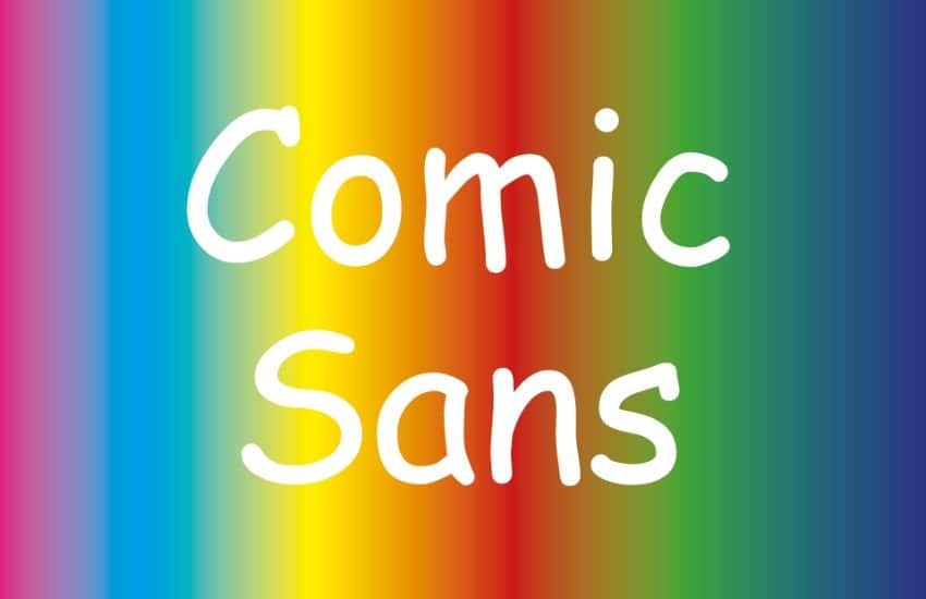
Out of many available fonts today, Comic Sans font is probably one of the most notorious examples because of several less than stellar reasons. So much so, it is highly not advised to use Comic Sans except for some very particular needs. Why is it that way? Why are we not allowed to use Comic Sans for professional purposes like academic or career fields? Although Comic Sans itself was originally developed with humble intentions to introduce children to the use of computers from an early age, Comic Sans has degraded into a reputation of particular infamy after decades of overuse.

A particular characteristic of Comic Sans is its perceived lack of elegance. For example, professional logo makers will not consider using Comic Sans to create a distinctive yet modern-looking logo.
In a world where logos can define the professionalism of a company, Comic Sans cannot provide that sense of consummate professionalism to the consumers, regardless of how serious the company is in providing services for the customers.
If you ask many people about their opinions on Comic Sans, one answer usually appears – and it is that Comic Sans does not have a proportional letterfit when used to make a sentence.
“Letterfit” itself refers to a condition where letters are put neatly in place when they are used in a sentence. Often, there are unnecessary and awkward-looking gaps between each letter in Comic Sans.
Thank you for reading this post, don't forget to subscribe!
This situation puts Comic Sans within the mindset of many people that by having unnecessary gaps between letters, the results can look very disorienting for many people.
While it is no doubt that Comic Sans can convey a sense of cheerfulness and happiness, these sentiments are not aligned with the professional fields’ demands for fonts that illustrate professionalism.
Its long association with being perceived as comical and goofy makes Comic Sans is not taken seriously by professionals. As such, the use of Comic Sans is highly avoided as people think that Comic Sans is incapable of convincing people with its letterings, despite content that uses Comic Sans talks about serious matters.
Because of its notoriety, Comic Sans is relegated to limited uses. Even these limited uses do not really use Comic Sans anymore to convey any subjects they illustrate.
In the 90s, Comic Sans were commonly used in entertainment and childcare fields as Comic Sans illustrated the entertaining and friendly faces of these sectors. However, even these sectors have shifted into using other fonts that significantly decreased Comic Sans’ professional uses.
Long after its conception, many professional places and companies have standardized the use of other fonts to convey their purposes and identities. Through numerous considerations, many of these places have outlawed the use of Comic Sans.
It is tough to find professional companies that use Comic Sans as a part of their logo and daily documents. Even though other fonts are usually more rigid in proportionality, companies opted to use them instead to show that they are professionals despite their casual and cheerful identities.
What was originally conceived as a font for childcare and entertainment materials, Comic Sans, unfortunately, has descended into a reputation of infamy for almost 20 years. Even so, many developers such as Pollux of Geminorum continue to develop fonts that are trendier for children as well. Find out their products here!

