Enjoy 25% Off All Fonts. Use Coupon Code ENDYEAR25 before December 31, 2025.
Home » Uncategorized » 10 Iconic Movie Font for Blockbuster Posters
On the huge screen, the tiniest details may have a great impact. A movie has to be sold to the public effectively and memorably to make an impact. When they choose the correct movie typeface, they may create a big impression on the audience.
An epic film calls for an epic font. From Star Wars to Spider-Man, their advertising materials’ typography helps cement their iconic status. Consider the last film you saw. Other designers have likely discussed altering a comparable typeface to get the desired effect.
Have you ever dreamed of seeing your artwork projected on a billboard? Grab these fantastic movie fonts today to be ready for your next project!
Choosing the right font is the first step in making good use of typography. As much as feasible, the typeface should be clear. Good size and quality aren’t necessary. The key to a good presentation is to choose legible typefaces.
In addition to the content, the typefaces enhance it. It aids in the comprehension of the content. Color, typeface, and text size all have a role in how well your intended audience receives your message.
It’s not uncommon for a piece of material to include uninteresting text. Typography may improve its aesthetic appeal if it is applied properly. Using eye-catching images may be the best course of action.
Kids and cartoons may be the focus of your film. As a result, the material should be lighthearted, lively, and entertaining.
Fonts that are straightforward, plain, and professional are best for content that has to be taken seriously. How the information is read depends on the typeface.
Your poster will have an aesthetic impression if you use a harmonious design. Using the same font for similar content provides continuity. Your display will be more orderly and clutter-free if the typefaces are aligned correctly.
Typeface selection may be an indicator of a designer’s skill and expertise. Text typeface and size are important in establishing credibility with readers. It will help your movie’s marketing efforts tremendously in the long run.
Your movie’s brand is enhanced if you consistently use typefaces and show your website in a logical sequence. The typefaces you employ while presenting graphics stick in the minds of your viewers.
As far back as the early days of cinema, intertitle speech was a requirement, and that relationship between film and typography has only deepened through the years. Particularly during the “golden period” of the movie poster, which generated outstanding artwork and writing still recognized today, this was especially true for the poster.
Wes Anderson’s film earned international recognition for its set design, heavily influenced by typography.
Annie Atkins created them and many other items such as t-shirts and other promotional material.
The typeface used in the movie: Archer, Russian, Cheltenham, Beaufort, Old English, Münchner Feature, FF Din, Trajan.
Corey Holms’ poster and promotional materials for Sofia Coppola’s classic comedy-drama feature clear and simple typography that matches the protagonists’ contemplative journey across Japan.
The typeface used in the movie: Kabel.
It’s safe to say that Bon Joon-Parasite ho’s is the most talked-about film of 2019.
The posters and credits have a simple and traditional design, with timeless typefaces. Unfortunately, neither the designer nor their work is mentioned.
The typeface used in the movie: Gotham, Garamond, LT Didot.
Typography in this Quentin Tarantino picture pays tribute to the 1970s, so you’ll be transported to a psychedelic world when you see it.
Several posters, promotional materials, and titles for Pacific Title and Mirage utilized typefaces designed in the 1970s.
The typeface used in the movie: ITC Tiffany, Goudy Heavy, Benguiat Caslon.
Sandra Collora initially developed the dinosaur theme park’s logo, and the typography used on the poster was not selected for the poster. Still, it was originally picked as part of the logo. According to the creator, this font, along with Papyrus, is more suited for use in theme parks like Universal Studios, Busch Gardens, and Alton Towers than on a printed piece of paper. Perfect for Jurassic Park, in other words.
The typeface used in the movie: Papyrus.
Andrew Probert, responsible for developing the film’s storyboards and finalizing Delorean’s most crucial feature design, was responsible for the film’s title lettering. After being used to title Back to the Future’s one-sheet and Drew Struzan’s poster artwork, the movie font has become synonymous with the film.
The typeface used in the movie: Time Travel.
George Lucas wanted the title to seem “extremely fascist” and “quite scary,” according to Suzy Rice, the woman who would design the initial incarnation of the now-iconic stacking Star Wars logo. Due to a book she was studying the night prior, Rice was confident that Helvetica Black was the best option.
The typeface used in the movie is Helvetica Black.
It was developed in response to the 1960s marketing explosion and its requirement for large-format fonts. Aachen Bold is a font evocative of ink-stamped “Wanted” posters from century’s mining towns. These sensationalist “true tale” journals, such as True Crime, True Detective, and FrontPage Detective, strongly impacted the pulp novels of the 1920s and 1940s in the United States, using the woodcut-style font as their cover typography.
The typeface used in the movie: Aachen Bold.
The hand-drawn typography for Vertigo adheres to Bass’ artistic idea that everything movie-related design—from its music to its title to its advertising materials—should set the mood of the picture. Thus, the lettering is erratic and imbalanced, conveying the story through typography. These films’ hand-drawn lettering eschewed established fonts that favor more abrasive and visceral.
The typeface used in the movie is a unique font by the creator.
We call it the “invisible” typeface because of its low-key appearance and wide applications. An award-winning documentary of the same name was produced in 2007 to commemorate the typeface’s golden jubilee. The documentary notes that Meidinger’s goal was to design a typeface “with excellent clarity, no fundamental meaning inside its form, and can be used on a broad range of signage.” Iconic sci-fi horror flicks like Alien and Poltergeist were represented by a typeface with such a humble beginning.
The typeface used in the movie: is Helvetica Black.
Tony Palladino transformed Robert Bloch’s 1959 novel, Psycho, into the iconic thriller. As hard as it is to believe, Hitchcock relinquished some creative control over his projects to acquire rights to the title art for use in promotional materials, including the poster.
The typeface used in the movie: unique font by the creator.
Several movie posters employ the Futura typeface, but two of the most well-known examples are 2001: A Space Odyssey and Eyes Wide Shut.
When Paul Renner created Futura, he had the goal of creating a design that reflected his belief that typefaces should follow modern ideas rather than be constrained by tradition.
The typeface used in the movie: Futura.
Here are the ten most recommended movie fonts that will transform your movie posters like nothing else.
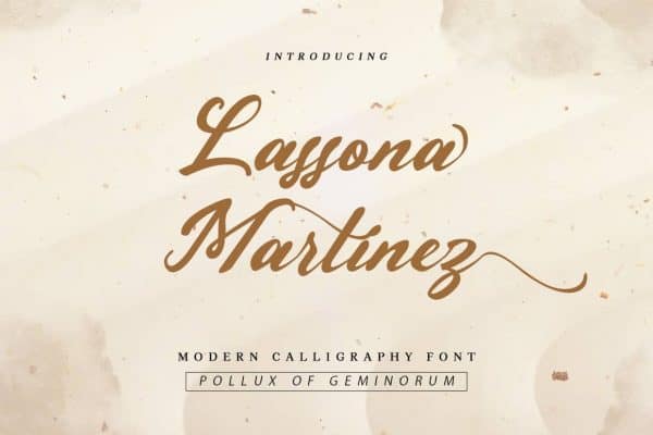
Use the stunning handwritten style of the Lassona Martinez font to give your work an elegant, painterly feel reminiscent of a Wes Anderson movie. Infusing a feeling of originality into your projects with this movie font type, which has bold streaks and gorgeous curves, is also ideal for social media branding, poster, and flyer designs.
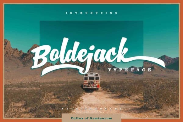
This typeface looks simple and relaxed at first sight, but it has a lot more going on beneath the surface. There is much more going on here than just a color scheme and design sense.
When we’re talking about movies, it’s an unrivaled tool for delivering a powerful statement.
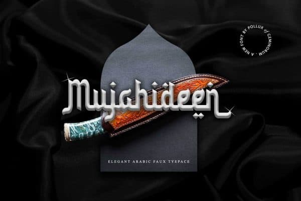
Mujahideen antique pirate font is a great choice whenever you want to make a statement, including in your movies. Aside from that, inviting cards, invites, branding materials, and headlines may benefit from this block signature font’s timeless style. Using swashes and ligatures, you may make your movie poster stand out in a crowd. The typeface comes with a slew of variations, including styles and variants.
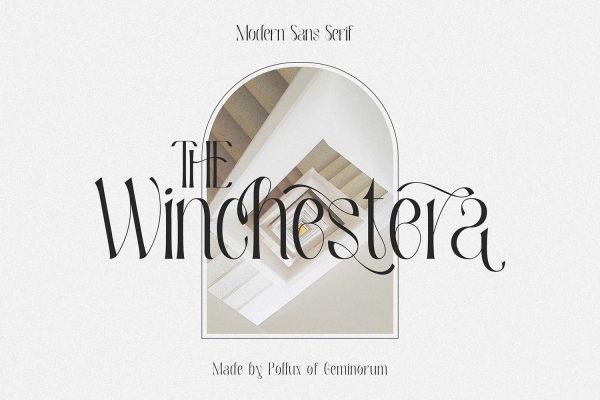
A movie font like The Winchestra’s is unique. With this gorgeous antique font, you may add a dash of refinement and charm to your next project.
The beautiful loops and antique look of the Winchestra vintage typeface make it an excellent choice for logos, headlines, and declarations. It’s a smart idea to have this typeface on hand for future promotional or marketing efforts.

Fonts like the Empire of Persia pirate font are appropriate to express a bold, adventurous vibe. In addition to its jagged edges and crooked lines, the hand-painted brush font has enough character for headings and titles.
If you’re looking to give your work a real, hand-crafted vibe, ancient typefaces that are both eccentric and beautiful can help. The Empire of Persia movie font is great for movie posters, logos, branding, stationery, and more.
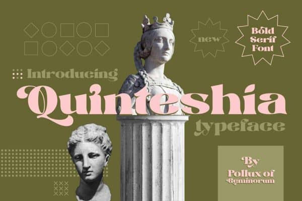
Do you need a typeface that’s different for your upcoming film project? There’s no need to go any farther in your search. Using the Quintheshia movie typeface, type in your message. The design of the typeface conveys an air of refinement and opulence. Using Quinthesia gives your design a rich vibe that will draw the attention of everyone else you.
Quintheshia is an excellent example of how this typeface’s slopes and tilts are perfectly suited for handwriting. I love the idea of using this in a bespoke or independent movie poster project.
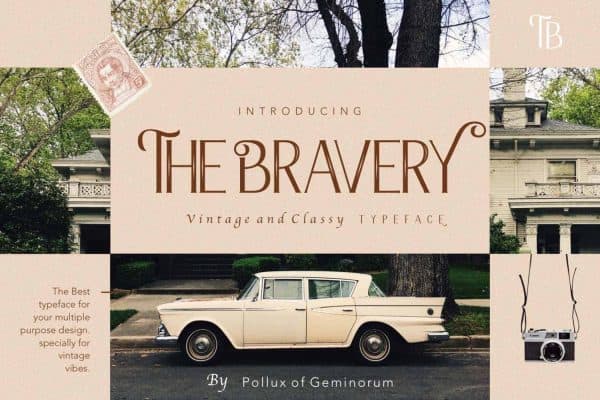
The Bravery and its famous movie typeface will never be forgotten. It’s easy to spot fonts like this one since they’re so distinctive.
The Bravery is ideal for independent films because of its smooth curves and calligraphic serif design. Put it on your poster as the final touch, and you’ll be good to go.
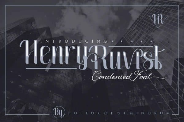
The Henry Ruvist movie font is a serif style font ideal for 1970s horror-themed movie posters despite its modest and curved appearance. Eerie feelings will cause you to remember back to the terrible jumpscares and gloomy chambers in horror films that you’ve seen in the past. When using this typeface, you can’t help but feel a little unnerved.
Your poster, newspaper, social media posts, and graphic gear will all look better if you use Henry Ruvist as the headline.
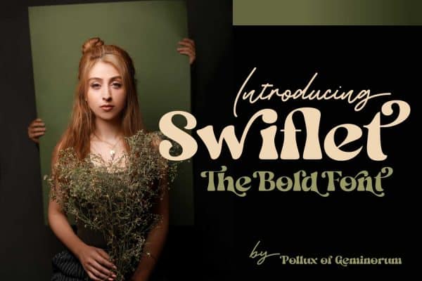
Using Swiftlet’s movie font style, you may create a Jurassic Park-inspired atmosphere in your writing. Your designs will stand out from the crowd because of this edgy font type’s distinctive curves and streaks, whether you’re using it for social media, posters, or flyers.

Nothing rivals Borrachudo for creating an unforgettable movie poster. Many people will praise you for this wonderful font from the film industry.
Have these movie typefaces gotten you in the mood to design your big-budget production?
Using the correct movie typeface, you may give your poster design a truly unforgettable sense. You can also use your imagination to create headlines, movie posters, and t-shirts. In addition to making your work stand out, this has other advantages.