Enjoy 25% Off All Fonts. Use Coupon Code ENDYEAR25 before December 31, 2025.
A strong brand image necessitates various elements, from the visual to the customer service. However, first and foremost, it’s always about the logo. While it’s an afterthought for many corporations, some of the world’s great company logos result from considerable effort and provision. And below are the said logos one can take for inspiration.
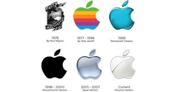
Memorability and simplicity are two of the features that define an effective logo. Hence, the Apple logo is one of the finest among the rest. So, what can people learn from this logo?
It’s worth noting that the Apple logo incorporates its products’ traits into its design. Their brand is entirely represented by the logo. When people think of their products, the words like sleek or accessible will automatically pop into their minds. That is what the logo represents.

There’s no better way than making use of a real target to depict the brand name of this retail company. While it’s simple, there’s more to the design than meets the eye. Target’s logo appears to be stand out among the rest because of its choice of color and simplicity.
The logo shape conveys community and trust, which are the company principle. The striking white and red also represent the company’s vision and goal. These two elements are the best way to design successful company logos.
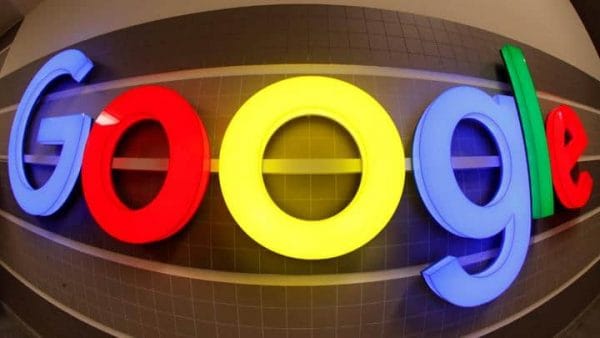
Google chose Sans-Serif typeface for its logo design. Since it’s a wordmark, color plays a significant role in the design. The creators opted for primary colors to give the logo an appearance that stands out. However, the secondary color in the letter “l” represents how the company doesn’t have to comply with the rules.
It’s fascinating to consider how the designers spent considerable time thinking of hundreds of hues before settling with those bright colors. One can also take insight from the Google logo that colors can significantly impact corporate logo design.
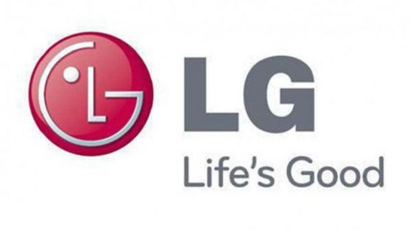
At first glance, the LG logo is just a combination of a circle and two letters in one primary color. However, if one looks closely, there’s an emoji face cleverly hidden in the logo. The letters themselves correspond to the corporate tagline “Life’s Good.”
Again, the importance of simplicity represents in the logo design of this electronic corporation. The designers managed to represent all of the company traits with two letters in Sans-Serif typeface, simple shapes, and one color. An effective logo can elevate brand visuals with only a few design elements.

Some company logos occur in shapes with no lettering at all. However, that’s exceptional for Mercedes. While they only display their logo on their vehicles, they still employ “Mercedes-Benz” in their advertising.
The Mercedes logo emphasized the importance of fonts, and each of them has a distinctive personality. Compared to other logos, it’s obvious how the curved edges of the typefaces used in the design evoke elegance, precisely the image this auto company would like to establish.
These five company logos are some of the finest ones today, and they all have in common. Clever use of lettering, shape, and colors while also complying with the principles of logo design. All these elements are the key to an outstanding logo. Each aspect can represent your brand personality. Should you want to use fonts, consider checking out Pollux of Geminorum.