Enjoy 25% Off All Fonts. Use Coupon Code ENDYEAR25 before December 31, 2025.

The menu is an integral part of restaurant marketing and service. Choosing the best restaurant font is just the first step of creating a menu that will draw your customers in. Perfect menu typography helps to tie in your restaurant theme and emphasizes the mouthwatering aspect of the visuals.
A perfect menu design could make or break your service plan and even business. Follow these tips to make your menu design as enticing as your other restaurant elements.

Using the restaurant theme is the easiest way to design the perfect menu. What does your restaurant specialize in? Whether they sell Italian food, cute desserts, or fine dining meals, their themes will determine the images, colors, and details your menu design would have.
An attractive themed menu is not just about aesthetics. If you advertise your restaurant online or through mail marketing, the menu’s look could determine their decisions. Therefore, an ideal menu design should reflect what the restaurant offers.
Restaurant fonts should come together ideally with the color palette. Different restaurant types often have specific color palettes to reflect their offers. For example, a fine dining restaurant often uses neutral or deep colors for quiet elegance. Organic or vegetarian restaurants use a lot of earthy tones. Dessert shops may use “sweet” colors like pastel shades, pink, and red.
Once you pick a color palette, finding the best font colors is more manageable. Your restaurant fonts can have color that comes with the default themes or something neutral that works well with every background color. Use at least two colors to distinguish different sections of the menu.
Which things do you want your customers to focus on? The special offers? The most favorite dishes? Today’s recommendations? Once you choose the highlights, use fonts to emphasize those, so the customers immediately focus there. You can use specific fonts or modify the existing ones, making them look different from the rest. For example, use Bold, Italic, larger size, or unique colors and textures.
Balanced layouts will make every element of your design shines, including the restaurant fonts you use. Use standard reading flow when designing the placement of the texts based on eye scanning patterns. Split your menu into logical breakdowns, starting from appetizers and starters, followed by main dishes, sides, desserts, and beverages.
Use multiple restaurant fonts for comfortable reading, but make sure you pair them correctly. Pairing serif or displaying font with sans serif is the most common method. You use the artistic serif or display font as the heading (such as your restaurant’s name), with more minor display texts for your menu segments. Use more standard sans serif fonts for menu details, making every text and pricing number legible.
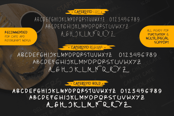
Once you understand the design principle, you can download pre-made restaurant fonts for a more straightforward design. Pollux of Geminorum offers high-quality display, serif, and script texts to use on your restaurant menu. Download the restaurant fonts that match your business theme, and create the most attractive menu to attract customers and bring income.