Enjoy 25% Off All Fonts. Use Coupon Code ENDYEAR25 before December 31, 2025.
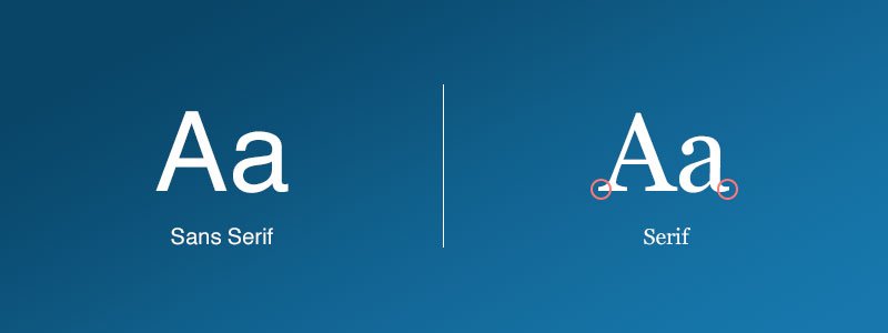
While there is discussion among print and online designers about what makes a good typeface for a project, the matter is complicated because many criteria are used to this judgment. In many cases, the discussion reduces to a single question: serif or sans serif font?
It can be a complicated endeavor to know how to apply different fonts and what kind of “serif” they are. You’ll understand all of this if you’re a designer, but the general public could be confused because it’s rather complex.
When it comes to a design, it’s essential to choose a typeface as it impacts the user experience, legibility, readability, and overall aesthetics. You may find yourself mired in the serif vs. sans-serif argument, no matter how much font experience you have. Understanding the differences between serif and sans-serif fonts is a good place to start.
In this post, we will investigate both kinds of case studies and assess if one is preferable to the other, and if so, when.
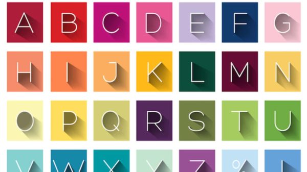
These are among the reasons why the right font is essential for your brand.
The length of attention of people is quickly decreasing, and it simply takes a few seconds. Brands must attract their target customers’ attention at this time of friction. Thus, graphic designers use the ability of typography to capture the attention of the spectator immediately.
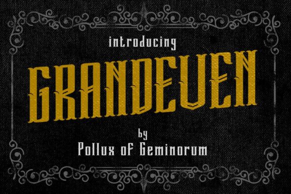
Most people think that advertising is solely made up of brilliant colors and amusing images. In actuality, it’s the typography that gets the attention of people most of the time. An illustration of a typeface that points to this is:
https://fontbundles.net/polluxofgeminorum/1572137-boldejack#gtmPos=3>mList=14
Typography can also be utilized to define the goals and tones of a brand. Each typeface can represent companies in a number of ways, based on what it does and what it stands for. This is precisely why so many different types of fonts symbolize different emotions and effects in a project.
For companies to compete, brand recognition is vital. Fonts are the visuals that purchasers or visitors remember in graphic design for a long time. These images help a company become famous among its customers.
You have to first notice its unusual font when driving past a Coca-Cola sign and immediately recognize that it reflects the Coca-Cola brand. That’s one of the concrete examples of typographical power.
One of the characteristics of typographic design would be that it offers individual design. Your design or website appears enjoyable or elevated, humorous, professional, welcoming, and so forth due to the strategic choice of fonts. You can use certain typefaces to reflect your brand’s features.
Here are some fonts with distinct moods:
https://polluxofgeminorum.com/product/hello-rebic/
https://polluxofgeminorum.com/product/the-winchestera/
https://polluxofgeminorum.com/product/anoletta/
Font expresses the general mood of the conversation.
Fonts and fonts have a significant role in the tone of the message since they help communicate a certain atmosphere.
Communication relies on font style, as shown by the examples. Even if someone were dishonest, if their message used a playful typeface, the fraud would be considered inconsequential. A more serious, corporate font for the launch poster of a new video game system might not be as well suited to deliver the message.
As you’ve come to understand the importance of font selection, we’ll discuss the differences between sans and sans-serif fonts, how to select the best one for your marketing materials, and why each of them could be useful.
Defining a serif typeface must take place once we establish a basic definition of a serif font. Serifs are tiny, thin, connecting lines found at the ends of strokes in typefaces. This assertion asserts that their works were first written in Latin so that they could be carved into stone.
However, the origin of serifs is still not well known, but it is widely recognized that the Romans used to paint letters with outlines onto the stone, which flared at the ends. Serif Font is now separated into four subgroups: Transitional, Didone, old-fashioned, and Slab Serif.
A serif font will seem more professional and stylish than a non-serif font.
Serif typefaces are very legible because of the chunk of text. As a consequence, the readability of the design improves. Serif typefaces are frequently found in newspapers and magazines in large type settings. These typefaces help design and aesthetics; therefore, they prefer to use them. All digital screens are more compatible with serif fonts because of their angular features.
The Bravery font is a vintage twist on the traditional serif types. The font exudes a more refined and polished version of classical serifs, which inspire dignity and respect. The family of The Bravery font has all the features to be your perfect next logotype, with all of its the swirls and curves.
Winchestra is typography that blends various styles, classic and modern. Winchestra contrasts a lot between thick and thin strokes to show harmony and grace. The font is a contemporary collection of serif fonts inspired by some of the most classic typefaces.
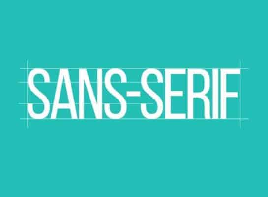
Sans-serif typefaces were first published in 1805. Whether they were printed in huge or tiny dimensions, their clarity and readability made them popular in advertising and exhibition.
As screens can not reproduce delicate serif features in a tiny way, sans-serif fonts are the most popular typefaces for displaying text on computer displays.
Without serif typefaces, they are famous for their attractive and distinctive appearance. Many site designers choose this font family over Serif Font. Without serif fonts, the design prints seem cleaner than serif fonts. They may be used on brochures and business cards since they are lightweight.
Ubuntu is a humanistic typeface for use in the Ubuntu operating system developed by Dalton Maag. It is noted to be quite rounded and excentric. The majority of letters’ curves are straight at the end of the stem; thus, a serif or ear is not indicated. Ubuntu has eight styles ranging from modest to audacious in weight. Ubuntu condensed and Mono are also available if you prefer a condensed or mono font.
Steve Matteson has designed Open Sans in 10 different styles, from mild to highly audacious. The typeface is simple, clean, and professional, yet highly vibrant. It has a lot of small elements, such as the letter J with an overall descender. Open Sans is beautiful in both large and small sizes, but the additional bold version is perfect.
Lato is maybe the most characteristic and fascinating sans-serif font on our list. It was made by Lukasz Dziedzic and is available in 10 distinct styles. It varies from slim to audacious. There are numerous unique curves in Lato’s letters that may be recognized in bigger sizes alone. This does not imply that Lato does not work well in smaller sizes; when it does, it just loses many intriguing features.
Roboto is the official typeface family of Christian Robertson’s Android operating system. Roboto is available in 12 weights, ranging from thin to ultra-colorful. The font is quite contemporary and incorporates the greatest qualities of classic types such as Helvetica and Arial. The standard typeface of Roboto is considerably condensed, enabling more characters per line.
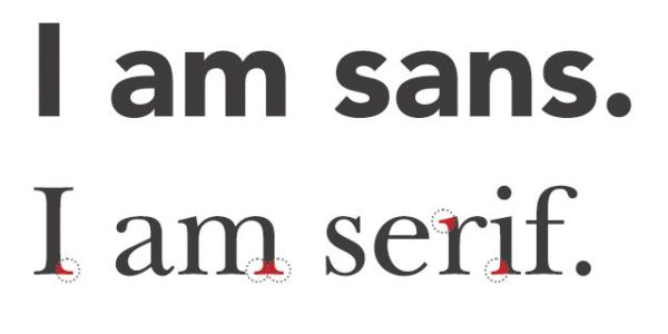
The “mood” of Serif and Sans Serif font is vastly different from one another. Serif typefaces are frequently associated with tradition or formality. Some people would even consider them to be elegant! Generally speaking, sans serif fonts are considered to be current, approachable, and straightforward. Because there are no decorative strokes, they have a tastefully simple appearance.
If possible, keep your design to just two fonts to maintain a balanced Serif vs. Sans-Serif font ratio. For the majority of designs, one of each should suffice.
When it comes to Serif and Sans Serif fonts, the way you use them is dependent on several different factors. It is defined by the nature of the project and the tone in which you wish to express yourself in the letter. Color and the types of images you employ in your designs are two additional crucial considerations while creating your designs. The distinction between Sans and Sans-Serif typefaces will always exist, although both types of fonts can be used in the same application.
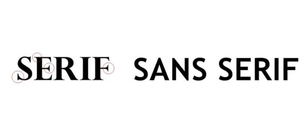
All the misunderstandings about letterforms that we hear often compound the difficulties in choosing a typeface – serif or non-serif.
Although some of these myths and tales were accurate in the past, modern publishing techniques (either printed or online) narrowed the gap between serif and serif and readability. Let’s see what occurs and see what happens!
True, serif fonts are still employed the most frequently in printed forms, but increasingly Sans Serif types are introduced that satisfy the most important need of all text reading.
The quality of the displays was previously much lower and some scrolls had great difficulty reading, but now we have closed that gap.
Based on readability tests, serif fonts are easier to read since the additional strokes distinguish each character. Significant letters are simpler for the eye to instantly identify.
Moreover, serifs can enable you “to push” the flow of letters, words, sentences, and paragraphs from one letter to the next.
Serif’s age may have something to do with this. The fact that it was used for publications considered to be “very serious” at the time led to the false idea that “sans serif” was already relegated to the realm of informal writing, which is clearly not the case.
However, this, too, is also untrue. Sans serif fonts are, in fact, typically adaptable, making them perfect for combining with a variety of other styles.

Make sure that the typeface you choose complements the message you aim to express when choosing a font. Some designers believe that sans-serif typefaces are simpler to read than serif fonts and that this is true. This implies that readability on devices with sans serif fonts isn’t as poor as it appears. Additionally, the typeface you choose has an impact on this.
In general, your message should be straightforward and unambiguous. Sans-serif fonts are great for use in headers and small text areas where clarity and legibility are critical considerations. When it comes to large blocks of printed text, such as on a flyer, serif fonts are the best choice.
To avoid relying just on a set of design principles when making design decisions, keep in mind to consider the full context before making a decision. Experiment with different font combinations and think beyond the box.
All in all, those are some of the surefire methods and tricks you may use to navigate your way around the topic of serifs vs sans serifs fonts, as well as a general guide to ensure that you can tackle the topic flawlessly. Whatever you choose for your next design, make sure it is readable, intelligible, and appealing to the audience for whom you are developing!