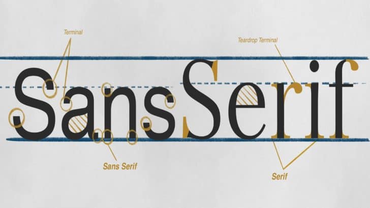
Choosing the right font is half the battle. It means by choosing the correct font in your files like the Sans Serif fonts in your assignment tasks or presentations; you have done so much in making your works more readable to the audience. Out of all fonts out there, why should it be Sans Serif? …
Why You Should Not Use Comic Sans Font for Professional Use
Out of many available fonts today, Comic Sans font is probably one of the most notorious examples because of several less than stellar reasons. So much so, it is highly not advised to use Comic Sans except for some very particular needs. Why is it that way? Why are we not allowed to use Comic …
How to Choose the Best Font for Your Video Subtitle
A video subtitle should be easy to read, comfortable to look at, and not obstructive. To achieve these criteria, choosing the best font for the subtitle requires several steps to avoid discomfort when viewing the video. Since there is no particular “standard” of video subtitle fonts, the only thing left to do is the ways …
Typography 101: Why Font Matters and How to Do It Right
Typography is an essential aspect of a design. It is the only major contribution to make the message of a design clear and accessible. The particular fonts that a designer picks for a project may affect how readable, legible, and attractive a design is and how efficient it is as a whole. In reality, to …
What’s the Difference Between a Font and Typeface?
The difference between font and typeface has become an issue for the mainstream audience. The explanation seems to be that design terminology in the modern conversation has become a common holder, and people use both terms interchangeably, regardless of relevance. However, at the technical level, typeface and font differences are differences that must not be …