Enjoy 25% Off All Fonts. Use Coupon Code ENDYEAR25 before December 31, 2025.

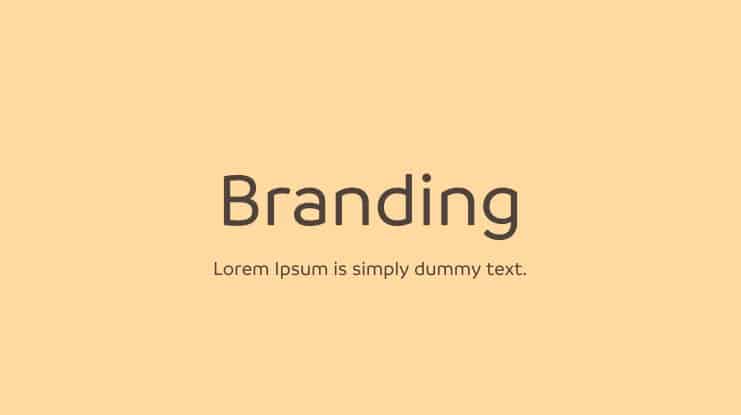
Every designer would never argue that font selection is one of the most arduous tasks in graphic design, especially when choosing a branding font. The fonts you pick can either make or break your brand identity. To help you in your quest to find the right font for your brand, we have put together a list of pro tips to employ.

Some experts may say that this one is very subjective. But let’s admit that you want the ambiance of your selected font to match your brand image. Avoid choosing a font based on what you like. You need to look at the font since they all have personalities.
A formal company doesn’t always need to appear serious. You don’t need to stick to your company’s font system. You can always try a new font and be creative. But you need to make sure your company’s brand identity can still be seen in your branding font.
When selecting a typeface for your branding purpose, look for one with various fonts. All the typeface’s fonts can make a good harmony should they use altogether. It makes your design process much more manageable.
If your website’s body text is Garamond, it would be best to adopt Adobe Garamond for the headings. You can also put EB Garamond in use should you want to include a callout. This method offers strong contrast while maintaining the website’s structure and quality.
When pairing one branding font to another, remember that the fonts should complement each other and offer solid contrast. The best approach to achieving this is to learn about the four font categories available today: sans serif, serif, display, and script.
A serif and sans serif is the most widely implemented combination. You can use a serif font for the header and a sans serif for the body text. You may also inverse the blend, and it will still make a harmony, a serif for the body text and sans serif for the header.
The following rule of thumb in choosing fonts for branding is not to use more than three types of fonts. Your product will look unprofessional due to the cluttered visual if you do. Many professionals advise limiting the use of font from one to two only.
Should you have to use three fonts, be sure it’s still in the same font family as already elaborated in point 3. After all, you still get strong contrast by employing typefaces with various fonts. Also, experiment with the sizes and weights to create more diverse elements.
Most professional graphic designers don’t employ a plethora of fonts in their production. They usually have their staple fonts to use daily. Some will say that Helvetica is the best font for branding, while others argue. If you’re a beginner, it’s always advised to stick with fonts that most professional designers will agree on.
That’s all you need to keep in mind when selecting fonts for your brand. It’s time for you to find one representing your brand’s personality. But the number of branding font collections is innumerable, and you may have difficulty finding the best one. To help you out, you can head to polluxofgeminorum.com and look for branding typefaces.