Enjoy 25% Off All Fonts. Use Coupon Code ENDYEAR25 before December 31, 2025.

There are a lot of fonts available, each with its own unique style and design. With the abundance of selection, finding which one to use on your design can be more than overwhelming, especially if you are new in designing.
Breaking them into different types and categorizing them can help you determine the best time to use a certain typeface. If you are new to graphic design, it is even more important to understand different types of typefaces.
In this article, we are going to discuss five categorizations of fonts that will help you better determine which typeface to use.

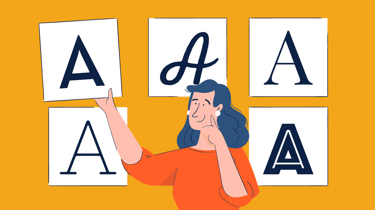
Serif fonts are characterized by small strokes that extend from the main stroke of the character. It is considered one of the traditional fonts and is commonly used for writings in a body text because of its high readability. However, it is not as easy to read on a small mobile screen.
In addition to the body, this typeface is also a popular use for brand logos. That is because it offers a classic, confident, and elegant look. It is also timeless and will always look good every time. Some well-known companies use this typeface as their logos, for example, Giorgio Armani, Vogue, Harper’s Bazaar, New York Times, and a lot more.
Different from the previous type, this one does not have additional strokes in its characters. That is why it is often considered more simple, crips, and modern. The sharp lines and simple shapes make it looks vivid against a bright screen. Therefore, Sans Serif is a preferred typeface for screens.
While Serif looks more traditional and classic, Sans Serif is often associated with a casual and youthful style. However, it is also commonly used in various brand logos. When used in brands, it will create contemporary and relatable vibes. Some brands that use Sans Serif typeface include Target, Toyota, Panasonic, and a lot more.
Then there is also Slab Serif, which is a branch of both Serif and Sans Serif typeface. While other serif typefaces tend to be slim, Slab Serif looks more bold and blocky. However, it still offers a classic, confident, and timeless look.
The bold and modern character of this typeface makes it good for brand logos that wants to create a bold and dramatic statement. Some examples of this typeface use as a brand logo are Honda and Wells Fargo.
Just like you may have guessed, the Script typeface mimics handwriting or cursive lettering. The characters of this typeface often contain curls, flourishes, and loops as decoration. It can offer a trendy look, fancy, and even relaxed depending on the shape.
While script typeface looks beautiful in a design, it is not effective in a body text. However, it can easily attract attention, making it perfect for headings, logos, or catchy phrases.
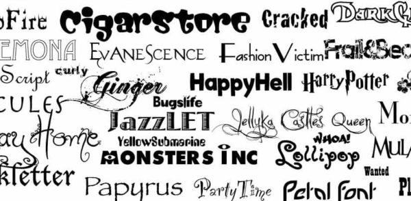
Last but not least is a decorative typeface, which offers a big impact on your design due to its beautiful style. With its decorative style, this typeface can communicate moods and atmospheres more easily and specifically. While it tends to have limited use, it is perfect for logo, main title of a printed design, posters, etc.
These are five categories of fonts that you should know to choose the right typeface for your design. Once you know the categorization, visiting a website that provides a collection of fonts such as Pollux of Geminorum will not feel overwhelming anymore.