Enjoy 25% Off All Fonts. Use Coupon Code ENDYEAR25 before December 31, 2025.
Typography is an essential aspect of a design. It is the only major contribution to make the message of a design clear and accessible. The particular fonts that a designer picks for a project may affect how readable, legible, and attractive a design is and how efficient it is as a whole. In reality, to ensure that the design would be both usable and attractive, you must respect the laws on typography.
Typography impacts the effectiveness of a design greatly. While designers are skilled in typographical terminology, and the discipline might be quite hard to traverse. More in-depth knowledge of typography may be obtained by looking at the types and evaluating their esthetic features, but this alone would give the subject a limited understanding.
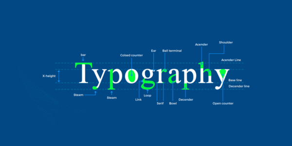
For both newbies and veterans who require a detailed crash course, here is a short lesson to learn about typographic principles and understand the complex jargon.
Maybe we might start with the most obvious terminology: typography. Many non-designers certainly use the word typography in their everyday lives interchangeably, but they do not grasp the meaning of the differentiation. The technique and ability to arrange the letters you see in print is called typography.
It is not just the way letters and characters are produced but also the reasoning behind setting up letters and characters influencing readability. The design does not transmit its essential concept without using powerful typography.
The two main reasons why typography is used in graphics are contrast creation and straightforward communication of information. First, readability is promoted, and secondly, it is utilized to make it easier to communicate the message, the tone, and the feel of design work. The esthetic features of typography may offer a polished feeling to a project. Attractive, user-friendly designs draw us in. And we often tend to escape from a complicated and strenuous, appealing design.
As you know, converting text into graphics is not easy and can’t be done with copy-pasting. No matter what kind of project you are working on, one may spend plenty of time just fiddling with the typeface. Why do we put so much work into typography? Let’s look at the top reasons to understand better why typography has become so essential.
Companies have a difficult time competing without brand awareness. The photos that prospective buyers or consumers take when they view anything in printed form are called fonts. These pictures assist a company in creating a reputation for its consumers.
For example, when you cross a Porsche sign, you immediately see its beautiful typography identifying the Porsche brand. One of the legitimate typographical influences may be found here.
The typographical design enables designers to develop their designs. Your piece of art or websites might look pleasant or high-end, funny, serious, or deliberately welcome utilizing types. Certain types may be utilized to communicate your brand’s spirit.
The usage of typography contributes to a coherent and harmonious design. In brand identity design, a strong visual consistency across all platforms should be established. It would be best to have aesthetic consistency to develop a smart and polished image and brand awareness.
As public attention declines, it has fallen to a few seconds. Businesses need to catch customers’ attention to engage their target customers during this time of friction. That explains why typography to graphic designers is so essential.
Many people would believe that only audacious colors and innovative graphics capture their attention. People are frequently drawn more so than anything else to the typeface. One of the most striking typefaces maybe this.
You may also use typography to establish the beliefs and tones of a brand. Corporations are portrayed in numerous ways based on what businesses do and represent. Therefore, many types of typefaces have a specific mood or influence on a design.
Now that you realize the necessity of correcting your typography, here are top-class principles to develop a polished font work.
Newcomers might assume that typography is a basic art alone. In reality, this is a really hard event; both creativity and science are involved. The language, size, and specifications of a typeface should always be identified and influenced. It is advised that you become familiar with the principles of typography by spending some time learning about typographic art.
The overuse of types and styles is the result of many designers’ mistakes. If you use over one font, take care not to employ over 2 or 3 varieties of typefaces. Ensure that three distinct fonts, one for the corps, one for headlining, and another for the subheader, are used.
You may highlight particular text lines by arranging the font so that only certain lines are much more relevant than others. Their visual hierarchy is manipulated in guiding their vision. The use of a typo-hierarchy is an essential aspect of any professionally designed publication. Without it, it would be impossible for readers to detect important pieces of information immediately.
The choice of types is rarely a random occurrence. Usually, selecting a typeface based simply on personal choice does not result in professional results. Typefaces have with them a personality. And the individuality of the typeface is communicated. A typeface needs to meet the demands and personality of your audience. You wouldn’t probably select a terrifying typeface for a family wedding, right?
Using a stretched font, their effectiveness and total value are reduced. Many people stretch their types to enhance their height or breadth. You can prevent typographic distortions by performing this in another method. For instance, you have the choice of selecting large or lengthy fonts from the apparently unlimited number of fonts accessible online.
One approach to give your project visual appeal is using white space like a productivity outlet. The efficient use of white space has numerous advantages. It emphasizes a specific part of your work and leaves a lot of design space. It keeps everything constant and easily enhances the overall design. White space may mean various things in the design without an additional element being included.
No matter what you generate, your content ought to be readable to your audience. It is illegal to use dark lettering on a dark background. And if you want to use a high contrast font, it is even worse. Even if your layout is stunning, if your message is incomprehensible, you will be wasteful.
Learn more about legibility and readability for your design.
The continuous application of your skills leads to their perfection. Knowing the typography rules might help you to create a structure that has an important typographic feature. Implementing these rules constantly is a simple approach to manage. Only in practice can you fully understand how the different rules operate. Remember always, these principles are not intended to limit you but to help you design excellent typography.
The core requires minute spacing modifications to generate simpler coherent letters. A beautiful kerning work makes a difference. The aim is to ensure that the spacing among each word is consistent and that a properly structured design results. Since they often include extensive sentences or paragraphs, these key errors are generally relatively small. For headers or logos, though, a horrific kerning work may damage a complete layout immediately.
Type alignment is essential. If you have previously dealt with Microsoft Word, you already know the four choices for alignment: left, center-lined, right-aligned, and justified. Left alignment is perhaps the most prevalent way of placing since it is readable.

What feelings are you looking for when your users visit your website first? Would you like to establish a friendly environment? Want to be pleasant, entertaining, or serious on the website? The typeface must reflect the personality of the brand. In the face of these difficulties, it is a good location to start defining the business’s essential properties and gathering the types that reflect these qualities.
Nothing is worse than a good website, but it’s incomprehensible, so you click on the erroneous button or pick the wrong way since the addresses are unclear. Determine which types to employ in your design, examine whether the typeface is understandable, readable, and accessible, and set aside the style, aesthetics, and voice.
A ligature develops when two letters join to produce a new character. They are designed for typefaces containing particular ligatures and may be modified to push them into other fonts.
Contrast is mostly a subjective idea that certain dissimilar types function well together, providing the illusion of diversity in the composition as a whole without compromising harmony. The contrast in a font refers to the varied thicknesses of the stroke that make up the letters.
While print developers most frequently refer to “leading,” “line spacing” is used by digital designers to express the same. Both words refer to the distance between baselines. The normal guideline for line separation is 1.5 times the size.
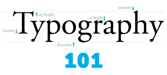
Types have a baseline, which would be the horizontal position, excluding their descendants, where letters sit. This lower row is crucial. Vertical measures may be carried out using the baseline, and it helps designers pick spacings.
Justified is a kind of alignment that does not give a white space after every line of the justified text since the content is centered on each line.
Each character in a font is a single letter, number, or symbol. A typeface containing just upper case letters may well have a character set that is likewise limited. Character sets, comprising hundreds of more letters, symbols, and figures, may likewise be vast depending on the font’s designer.

With a fun approach to typography, Fridayfonts is the place to seek fonts with TGIF vibes. The term comes from the typographic workshops held by the young designers every Friday.
Most font sites are business or formal, yet they are not formal. Friends of Type is meant to seem like an online book in which participants may be creative and present their designs.
Since six years of motivating designers and individuals alike, Typeverything is designed to highlight creative designers and businesses. The site is organized into several areas, including Serif, Sans Serif, and Lettering Brushes.
As the title suggests, Typeinspire is around to encourage both you and others. The user interface has been developed to satisfy their users to quickly find your favorite font by navigating the images and categories.
Housing over hundreds and thousands of creative fonts, Fontbundles deals only with top quality and affordable fonts from freelance creators. They often offer discounts of approximately 96 percent off typefaces.
Every week, they also give a font for free. Likewise, on their marketplace, artists may register and advertise their typefaces for sale in font packages as well as discounts.
If you’re interested in purchasing fonts for your creative project, you may visit their collections.
The explanation of typography may be brief and simple, but a variety of facts, such as its aspects, still exist that enhance your understanding.
Mastering typography can make you a better creative and a better user who can comprehend customer problems from both viewpoints.
So, what do you wait for? Begin to implement what you have learned today, and we look forward to your fantastic creative endeavors.