Using fancy fonts in design is a little tricky. While they are beautiful, they are usually intricate and can be hard to read. If you are not careful, fancy typefaces will look like purposeless design features other than “looking pretty”. Follow this guide to turn fancy typefaces into more purposeful design elements.

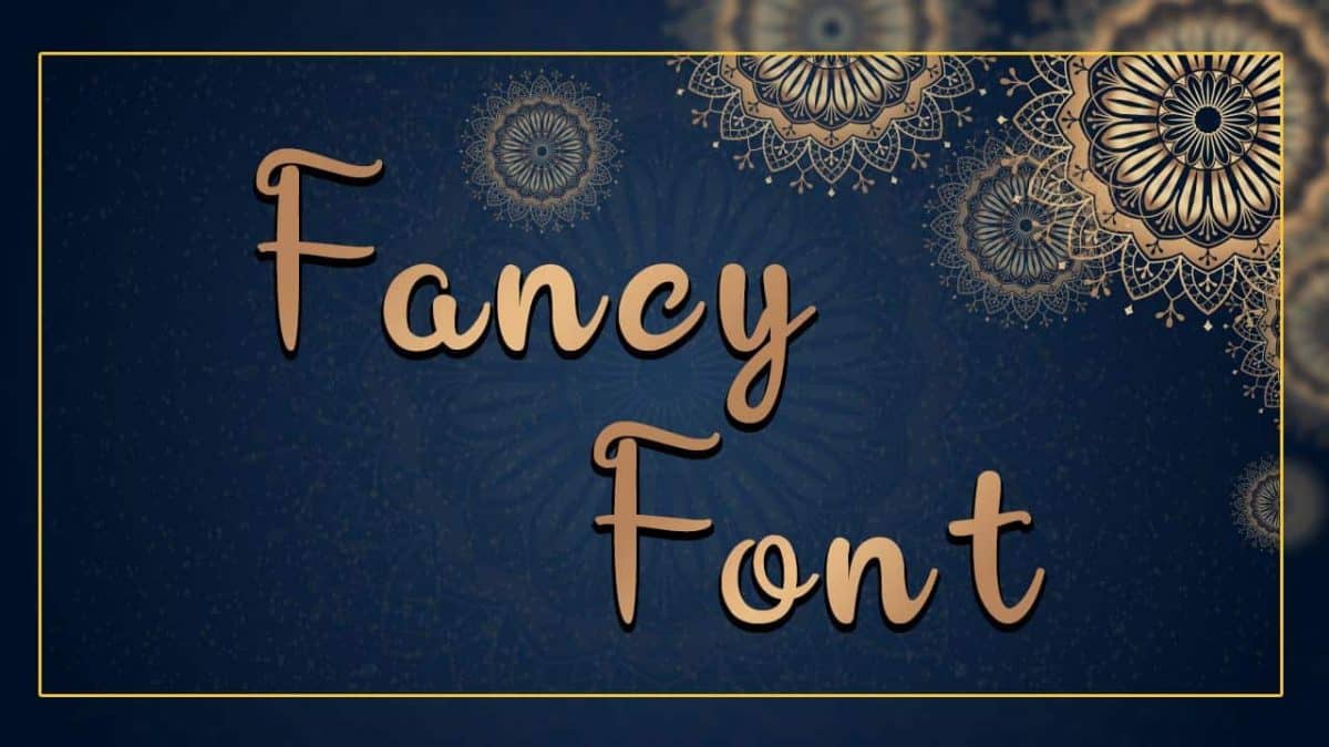
Fancy fonts are often referred to as display fonts and usually have exaggerated or extreme features. Examples are exaggerated swashes, handwriting-like scripts, extended serifs, artful letterings, and fancy underlines. These characteristics make them not ideal for body texts because they will reduce the readability.
Some display fonts are created to fit certain themes. For example, cute fonts are colorful with effects like crayon strokes or childlike handwriting. Vintage fonts have block characters similar to texts on old-timey posters and advertisements. “Horror” fonts have “blood” effects or similar fonts like on movie posters and horror novels.
Fancy fonts should contribute to your designs without ruining other factors, like readability and professionalism. Here are several useful tips for using such fonts and creating meaningful designs.
Thank you for reading this post, don't forget to subscribe!
All caps might draw the eyes, but they are not always the best design option. All caps can reduce the smooth flow between characters, making the typeface look harsh and unsightly. The flow will be better if you stick with standard uppercase and lowercase combinations. This applies to designs such as wedding invitations, greeting cards, business cards, and newsletters.
There are some exceptions to make. For example, you may use all caps if the font is used for one word, such as brand label, team logo, or mascot.
The exaggerated features of fancy fonts will make them harder to read with small sizes because the features are “lumped” together. Thirty-two points and upward are ideal sizes if you want to use them as headlines, headers, or titles. However, this size rule can be adjusted with the actual size of the object they are printed or written on, especially on things like business cards and printed magazines or newsletters.
If you need to create a professional-looking design, pick a font that has minimum exaggerations, such as on the serifs, stems, and loops. Serif-based display fonts or sans serif with subtle embellishments can be a good start. These fonts will improve the readability factor and reduce the unnecessary decorative elements without losing the unique style.
The space between characters will determine the way your typeface look. Kerning is especially important in fancy fonts because there must be enough space for the embellishments. Everyone must be able to read your texts without having their eyes bungled by improper character spacing. The same thing applies with leading, which requires you to create proper spaces between lines.
Instead of using the font as one sentence or phrase, stick with just one letter as the initial cap. Even if you use more conventional sans serif or serif fonts, initial decorative caps will create a unique point on your design or page. Plus, you do not need to compromise the readability factor.
Finally, ask for second and third opinions after choosing a display font. This is to make sure that everyone besides you can read the text with that typeface. Don’t forget to find the best fancy font from Pollux of Geminorum to get the best font for your design.

