You only have one chance to create an excellent first impression. Everyone knows it, and that’s why people dress up nicely for job interviews. However, so many writers tend to belittle it regarding a font for their book covers.
Most writers might think that the cover image will sell the book, but only one part of the cover. In the bookshop, readers mostly notice the back of the book first before the front cover. Therefore, the fonts you use for the cover should be convinceable enough for them. So, let’s delve into the discussions on guide in choosing book cover fonts.

It’s worth noting that the cover of your book differs from the body text. When thinking about the exterior part of the book, you’ll usually think about something more visual, primarily what typeface is mainly used for book covers.
The primary approach to finding out the right font is by identifying the target audience. Design is a very subjective matter where everyone perceives a book cover in many different ways. If your book is for young audiences, then opt for fonts specifically established for youthful design.
Emphasizing genre is essential when selecting typefaces for a book cover. Typography is also a subtle yet effective approach that can help you convey your story’s genre and mood.
Thank you for reading this post, don't forget to subscribe!
If you’re composing a non-fiction book, of course, you don’t want to choose some informal typefaces a middle schooler might be fond of, such as comic sans. The typography should communicate the genre. Getting an understanding of typeface psychology will allow you to find out the right cover fonts.
Readability is one of the many factors you should bear in mind when selecting book cover typography, especially for its title. A tall and condensed typeface is ideal for long titles. Shorter titles usually require a larger one that can fit properly in the frame.
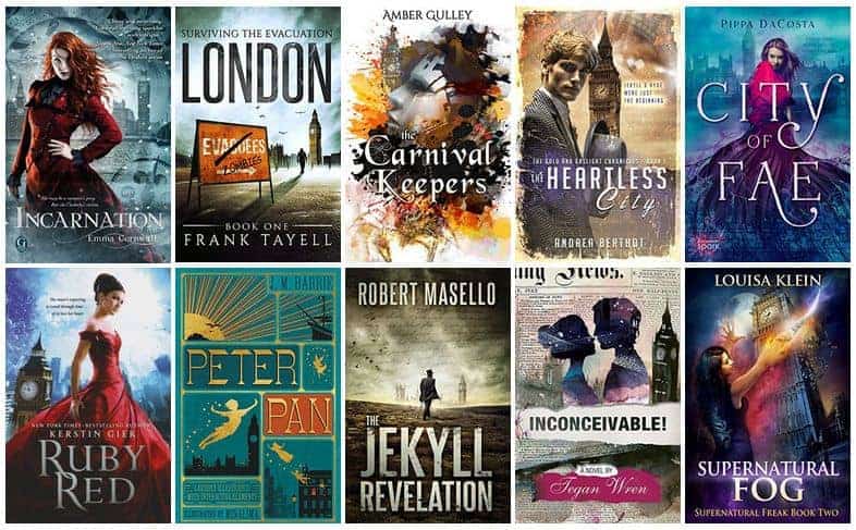
Note that there is no such thing as a universal title typeface. However, most bestselling books use a meticulously chosen typography that promotes high visibility, making them stand out among the rest.
Your title is not the only part of a book cover that uses the font. You also need to determine the proper typefaces for the copy on the back cover, the author’s name, and the contents. Those three commonly utilize the same type of fonts or anything that is reasonably similar.
Most designers advise using only two or three typefaces throughout the book. Your title typography should blend nicely with other texts. Try pairing serif with sans-serif typefaces. They can make a good combination that appears as though they belong in the very same book.
Making a stand-out book cover doesn’t have to be complicated. It can be started by selecting the most straightforward typefaces and thinking about their placement. Be bold in trying various alignments, for no rules are defining each text on the cover.
The most crucial factor is keeping your typeface choice aligns with your genre, cover image, and style. Check out your favorite books, visit a nearby bookstore, or just Google “beautiful book covers” for ideas and samples.
As previously mentioned, it’s not only the picture that matters in your book cover and can influence the selling. The typeface you use in it also plays a significant role in grabbing the readers’ attention.
Selecting the right cover font that communicates every aspect of your book wouldn’t be that hard if you equipped yourself with a comprehensive guide above. Should you require some inspiration, head to Pollux of Geminorum platform, for they offer various types of book cover typefaces.

