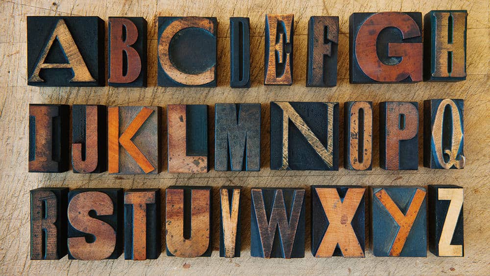
Just as its name suggests, display fonts are typefaces that are mostly used for display purposes. This type of typeface is designed for short text and often in large formats such as posters, billboards, logotypes, etc. Therefore, its shape can be varied and very artistic due to such usage.
If you are looking into using this type of font for your design, you will need these useful tips to step up your design gigs using display typeface.

Many fonts available are perfect for use in English, but not so much when used in other European languages. One of the reasons is that there are a lot of diacritics used, and many of the fonts used do not support that.
Many designers end up adding their ‘handmade’ diacritic marks to the font they are using, which turns out terrible. Although it is a small and simple mark, badly drawn diacritics can spoil the layout of your typography.
Therefore, rather than drawing the diacritics yourself, you should opt for a display typeface that supports multilingual characters. This way, you don’t have to worry about drawing bad diacritics to your typography.
Implementing this type of font is sometimes more of a creating illustration than typesetting. Therefore, just like other illustration-making work, you will need a lot of inspiration and experiments to create or combine unique typography using display fonts.
You can draw the shapes and styles of the character you want before finding the fonts that perfectly visualize what you draw. Therefore, you don’t waste too much time trying out different fonts to use. Also, if it turns out you don’t find the fonts that match with what you’re envisioning, you can always create it yourself.
One of the crucial parts of typography, especially when you are using display typeface, is clarity. You need to find whether the fonts you are using look good and readable at the intended size and distance that it will be displayed.
After choosing the fonts and implementing them into your design, you can ask other people to see if they can actually see and read what is written there. If they don’t, then there is no point in using it.
Mixing and matching fonts can make your design look more interesting. However, it is also not an easy practice and sometimes needs a lot of experiments before you can find the ‘right’ combination.
Find other familiar fonts that often use for specific designs, then use them in a completely different design. For example, try experimenting with your headline font. Find fonts that are often used in pub windows, then use them in design for an art exhibition. You may see that sometimes it can give your design a refreshing vibe.
Display fonts should have the ability to evoke the emotions of the audience. They can add fun, playful, daring, or even bold vibes to your design with the appropriate use. The fonts tend to have their own character, and it will be even clearer when put to use. Therefore, you need to be careful in using them.
Display fonts are often fun to use and play around with. It is bold and can easily display the message and emotion that you are trying to convey. So, feel free to find as much font inspiration in various font websites such as Pollux of Geminorum and have fun experimenting with these types of awesome fonts!
