Typography is not only about choosing fonts or adding text to your design. It is also an art of arranging characters so that it is not only readable but also visually applying. When text is arranged beautifully, it will not only enhance the overall layout of the design but can also attract readers as well.
In order to practice typography, it is important to learn about some of the basic terms. When you understand the terms, you will be able to easily understand all the necessary resources that will help you in typography. Here are some of them:

Another word for typeface is font family. It is also considered as the font design that designers use and is a collection of specific fonts. It includes all letters and punctuation.
Serif refers to an extra stroke at the end of each stroke of the letterform. This artistic addition makes this font distinctive enough. It is also considered as the more legible typeface. Two of the most commonly used Serif typefaces are Georgia and Times New Roman. This typeface is often considered traditional and evokes the professional vibes.
Sans means absence, therefore, Sans Serif also means the absence of Serif. This typeface doesn’t have an additional stroke at the end of each stroke of letters. The most commonly used typefaces in this family are Helvetica and Arial. This typeface is often considered contemporary, simple, and clean.
Thank you for reading this post, don't forget to subscribe!
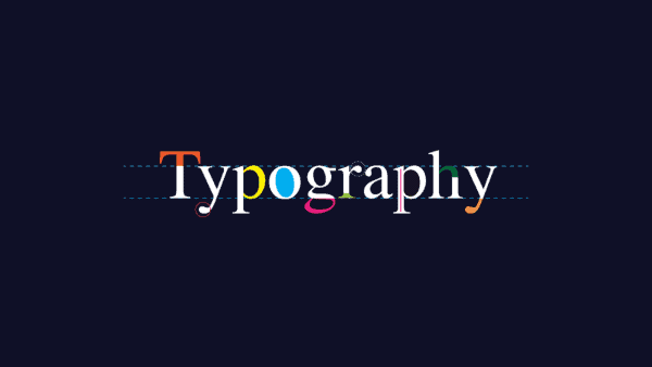
Baseline refers to the imaginary line at the bottom of the letters where each letter rests. This can be an important guideline especially if you are using multiple fonts with different characteristics because you will be able to adjust based on the baseline.
Midline also called Mean Line, is the imaginary line in the middle. It is apparent in a lowercase letter because that is where the non-ascending letters stop.
Ascender refers to the line of the lowercase letters that stretched until above the midline.
It is the opposite of ascender. Descender refers to the line of the lowercase letters that stretched until below the baseline.
Body height refers to the letter’s length from the top to the bottom.
Ligature refers to the combination of two or more letters into one single character. For example, ae to æ, et to &, and fs to β, and so on.
Leading refers to the vertical space between baselines of two lines of text. In word processing programs, it is often referred to as spacing.
Kerning refers to space between characters.
It is the semi-transparent pixels found around the corner or edges of letters. The function of anti-aliasing is to smoothen the texture of a letter.
Last but not least is the double story which is a type of letter with two counters. For example, the lowercase g have two different forms which the other may look like number nine.
Now that you know some of the terms commonly found in typography, don’t forget to visit font websites such as Pollux of Geminorum to look for font inspiration.