Album covers are often as iconic as the music, combining images and fonts to create unique artworks. Billboard acknowledges this by making the list of 50 best album covers of all time. From legendary icons to contemporary artists, they offer precious lessons for designers anywhere.
Fonts are special because people often dismiss their roles in artworks. Here are some lessons about fonts and typography that you can take from some of the albums in Billboard’s list.

Taylor Swift’s iconic 1989 album cleverly uses handwriting script with black marker effect. The album name was printed below a polaroid picture, as if someone was marking their favorite photo in an old album. The unique typography creates a nostalgic effect, marking the big departure of the artist in her musical journey.
1989 also made use of the internet culture to increase the album’s popularity. Many fans use their own polaroid photos and handwriting texts to recreate the album cover, sharing them on social media.
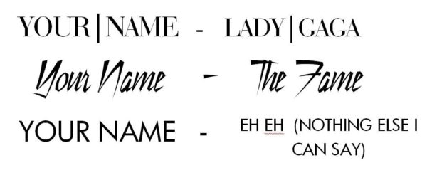
Lady Gaga’s The Fame Monster is a perfect example of how simple typography enhances a design. The cover features Gaga in a dramatic black and white picture, complete with dark grey background to emphasize her hairstyle and shiny leather jacket. The all-caps, sans serif font goes well with the background. The text uses simple white color, but with the slightly elongated “T” in the word “Monster” to show her usual daring aesthetic.
Thank you for reading this post, don't forget to subscribe!

Johnny Cash’s American IV album is an example of simplicity done right. The singer’s name is printed as a white, bold, all-caps text on a black background. It works because Cash is already an iconic name in the music world. It also works for the simple yet somber cover design since this was Cash’s last album before his death several months later.

Sex Pistols’ 1977 album has a controversial cover that effectively combines fonts, words, and colors to the fullest effect. The album’s name combines serif and sans serif fonts in black, against the yellow background that further emphasizes the daring look. Meanwhile, the band’s name is emphasized with a casual display font, combining pink and yellow to the shocking effect.
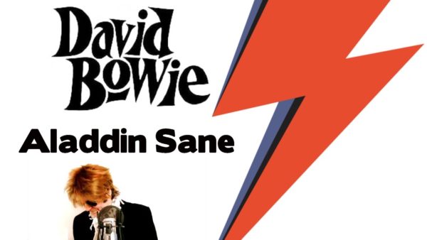
David Bowie’s iconic photograph, with a strike of thunder across his face, came from Aladdin Sane. It features Bowie on a simple white background. The serif typeface for his name and album title is simple since the focus is Bowie’s face. However, they are colored with the palette from his photo to match the theme.
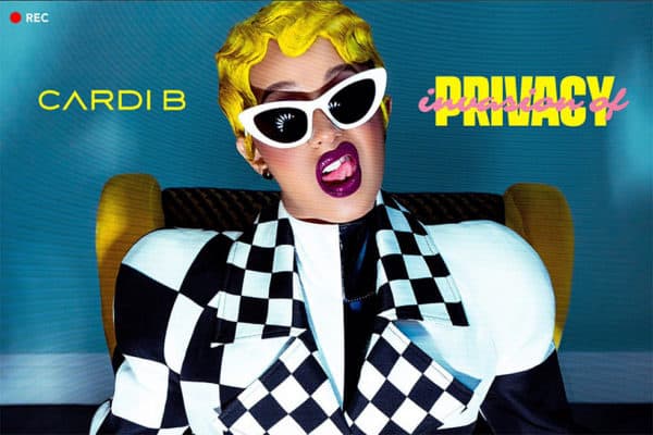
Cardi B’s 2018 album uses three fonts for her and her album’s name, a daring choice since multiple fonts often make a design look busy. Following the photo concept, her name and album title use serif fonts with different styles, with yellow color to match the most eye-catching element of her photo (the hair). The words “Invasion of” uses a bold handwriting script in pink and lower case, creating a contrast with the word “Privacy”.
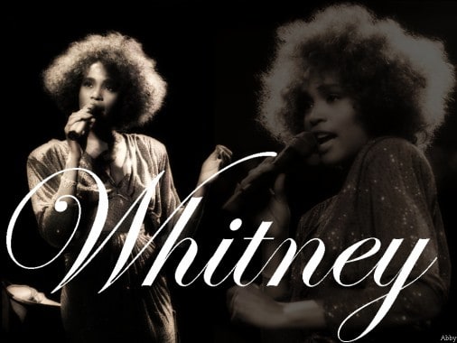
The font style and color combination on Whitney Houston’s debut album cover may look a bit garish. The all-caps font is in grey while the background is orange, not enough contrast to make the typeface look strong. However, the album’s cover was a breakthrough in 1985. During the era of explosive images and colors made popular by MTV culture, Whitney Houston’s muted album cover promises class and elegance, proven by her iconic voice.

Nikci Minaj’s 2014 album is another example of perfect balance between typeface, image, and color palette. With a simple combination of white background and shocking pink, the album title and the singer’s name use the same color but different fonts. Minaj’s name is in all-caps sans serif, while her album’s title is in bold handwriting script. Simple but effective.
Elvis Presley’s debut album uses his expressive singing picture as the image, enhanced with bold typography. The black and white photo provides a perfect background for the bold display font in pink and green. The name “Elvis Presley” frames his photo instead of just being printed horizontally to make it more interesting.

The Clash’s 1979 album is featured here because the cover is a tribute to Elvis Presley’s debut album. The image and typography are similar, with green and pink display font framing a dramatic black-and-white image of guitar-smashing on the stage. In addition, the name “The Clash” uses a bold sans serif font in simple white to balance the eye-catching album name.

Public Enemy’s Fear of the Black Planet album cover matches the typeface with the theme and imagery. The name “Public Enemy” uses a bold Nashville serif in red, a typical “Wanted” poster font. The album artwork features elements of Afrofuturism, with a final touch by an actual NASA illustrator. Therefore, the name of the album matches the art with bold yellow serif, with a titled style that matches the opening narration of Star Wars.
Janet Jackson’s 1989 album is different from the era’s colorful and cheerful pop culture imagery. Matching her military-style outfit and the emerging social consciousness issues, the album features a large negative space filled with black. Her name and the album title are printed in grey serif font, using different sizes to distinguish them. The typeface perfectly fills the negative space without taking away from the dramatic album image.
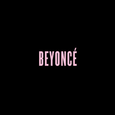
Beyonce’s 2013 album of the same name uses the pinnacle of modern design: a minimalistic style that says a lot. This album uses a sans serif font called Knockout, described as both “fierce and sexy”, reflecting Beyonce’s personality and statement. The font’s color is the combination between pink and subtle grey, which is both masculine and feminine, suitable for Beyonce’s brand of fierce woman.
Unlike many artists, Beyonce often prefers established fonts for her albums. They reflect her unmoving artistic credibility and big status in the music world.
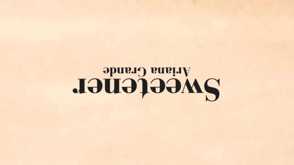
Ariana Grande’s 2018 album uses a small typeface as the album title to emphasize the unique image: Grande’s photo being printed upside down. The album cover reflects a change of music style from her latest album, becoming more thoughtful and lean to gentle R&B. This is reflected in the album title font, which uses Bodoni, a family of serif fonts with elegant look that still look modern.
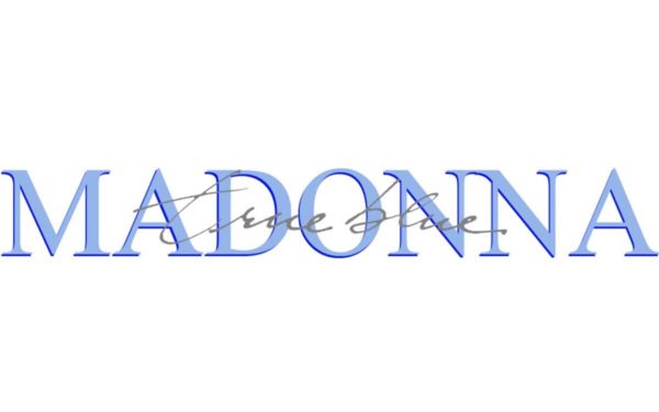
Madonna’s third album uses her photograph by famous photographer Herb Ritts as the focus. The cover uses two fonts, with Madonna’s name in blue, bold, all-caps display font. Her name is located on top, making the album image look like a magazine cover. To balance it, the album title uses grey handwriting script placed on top of Madonna’s name.

The display font used to spell Metallica’s name is so iconic, it became a font style of its own. In their album Master of Puppets, the band’s name was printed in large size and on top position, since that’s where everyone’s eyes will go. The white font looks bold when printed on the red sky background. Meanwhile, the album’s name was printed in simple white sans serif font, balancing the name of the band.
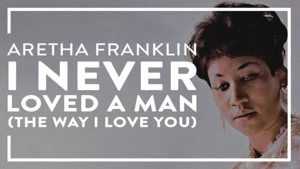
Aretha Franklin’s 1967 album cover uses calligraphic font for the title and her name, using different colors and sizes to distinguish them. The calligraphic font works well with the gauzy white background and her elegant photo in a beautiful dress. The combination also served as a political statement at that time, since she was one of the few black women featured so heavily in pop culture. The elegant look, including the font, was a subversion of typical glamor photos of (white) Hollywood actresses.
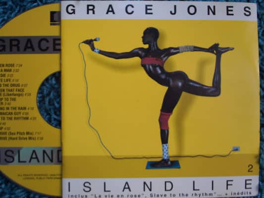
Grace Jones’ Island Life album cover features a daring photo of her in yoga-like pose, and the fonts complement it. Her name and the album title were printed using two different types of sans serif fonts, with simple black characters on white background. The characters have wide spaces between each other, deliberately elongated. The result was a perfect parallel between the elongated texts and Jones’ pose in the photo.
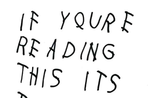
Drake’s 2015 mixtape album uses a very simple but effective concept. It uses a casual handwriting script with slightly squiggly strokes, black on top of a white background. The unexpected combination forces people to look and make quite a statement amidst modern font trends of using bold sans serif for their album covers. It also reflects the unexpected release of Drake’s album.
Just like Taylor Swift’s 1989, this album made use of internet culture in the mid-2010’s to popularize the music. Many fans use the design and typography to make memes, replacing the album name with their own words before sharing them on social media.
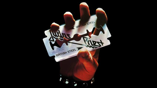
Judas Priest’s British Steel has an unforgettable cover art with a hand holding a razor blade. The typefaces for the band name and the album title were creatively placed on the blade, with the name Judas Priest printed diagonally using a display font. The word “steel” also thematically matches the texture of the blade; an example of using typeface and texture to reflect an artwork’s theme.
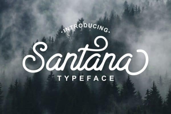
Released in 1970, Santana’s Abraxas is the antithesis of modern typeface and cover design in the modern era. The psychedelic image was taken from the Black Mary painting by Mati Klarwein. The rich color palette is a perfect background for the stylish calligraphy font, printed in white text color and red outline to match the artwork. The font and the painting have strong contrast that still makes the words readable despite the “busy” background.

Despite being released in 1975, Patti Smith’s Horses has a modern sensibility in design, especially with the typeface. The cover uses her photo in masculine outfit, with a monochromatic grey palette. The soft grey negative space provides the perfect background for simple sans serif typeface printed in black. The overall look reflects the poetic quality of her lyrics, which were inspired by the beatnik movement.

Even if you never listen to Nirvana, you must have seen their iconic Nevermind cover, featuring a naked swimming baby chasing a Dollar bill. The pool’s blue water provides a perfect background for the band and the album title, printed in black for readability. Nirvana’s name famously uses Onyx font, while the title is an original display font printed with a squiggly effect that resembles waves.

Hole’s Live Through This uses typography that subverts the theme of the cover image. It features a beauty pageant queen wearing a winning crown, but she is crying until her mascara runs. The image is a critique toward the beauty industry that impacts many women negatively. Following the theme, the band’s name and the album title were printed in pastel pink and white, using artistic display fonts. It creates a bold look against the dark blue background.

The Roots’ Things Fall Apart cover image serves as a political statement, and the fonts reflect the imagery. The photograph depicts two women running from the police during the riot in 1960’s, reflecting the racial unrest of the era. “The Roots” name was printed with white sans serif font against the black background. The title of the album was the only one printed in red, creating a difference between the group’s name and the album title and also reflecting the image.
These album artworks are only a handful examples of perfect designs. However, a designer can learn a lot from studying the perfect use of fonts and typography to create striking images. Start making your own album cover artwork now and download the fonts you need from Pollux of Geminorum to get stylish, modern designs.