Graphic design is an ever-evolving technique and any designer will need to keep up with software, techniques, and a lot of other things to keep their designing game sharp. This is also true in typography, as people in any stage of design still often get caught off in simple mistakes.
While it may look simple, sometimes this mistake can highly affect the overall results of their design. Some of the simple mistakes but keep repeatedly occurring are when mixing and matching different fonts in a single design.
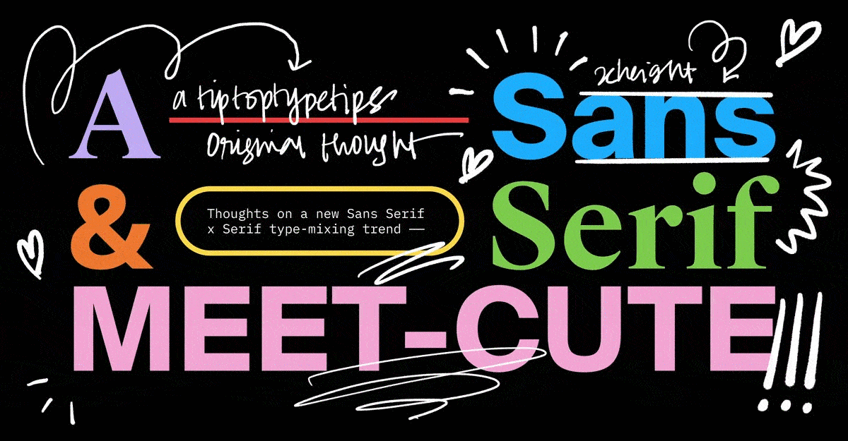
Typeface selection is an important part of any design project, but it certainly can be tricky to mix and match multiple typefaces. To make sure you avoid the same mistakes, here are five don’ts that you can avoid to keep your design looks cool and professional.

When done appropriately, mixing and matching typeface can help your reader understand each section of the message in your design better. However, if you are using too many typefaces and changing them too often, you will confuse your reader instead.
With too many jumps between one type of typeface to another, readers’ focus will be shifted from understanding the messages to figuring out what are the points of all the changes. Additionally, it can also make your design looks cluttered instead.
Each font has different optimal sizes where designers think they look best. Some typefaces look better when they are bigger when others are best in a smaller size and used in the body. While you can interchange them as you see fit, sometimes it doesn’t work.
The reason for this is because each font has different spacing settings between the lines of each character, space between characters or kernings, and the letter shapes themselves. These factors affect how the characters look like.
Many fonts are versatile enough that you can use it for any purpose and it still looks good. However, certain fonts convey specific feelings which will end up look odd if you’re not using them appropriately.
For example, you are creating an advertisement for an ice cream product. However, you use a dark and gothic style of typography, which certainly doesn’t match with the fun, sweet, and sunny vibes that are commonly associated with ice cream.
When using multiple fonts, you have to make sure that they are distinctive enough or readers will not be able to differentiate them. If it is barely indistinguishable, it can confuse readers and their focus will shift from reading the message to finding the difference between the typeface.
Using a typeface in a similar style can be tempting and you may feel like it will look good. However, it will make your design look messy instead when the typeface is constantly shifted between each other.
Lastly, avoid using clashing styles. While it is true that you shouldn’t use a similar typeface, using clashing fonts will not look good for your design either. As a rule of thumb, make sure you use typeface from the same family.
These are five don’ts that can help you in mixing and matching fonts together in a design. Now that you know some of them, what mistakes that you constantly doing? Find your inspiration in mixing and matching fonts in a font website such as Pollux of Geminorum.
