Enjoy 25% Off All Fonts. Use Coupon Code ENDYEAR25 before December 31, 2025.

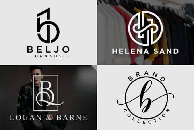
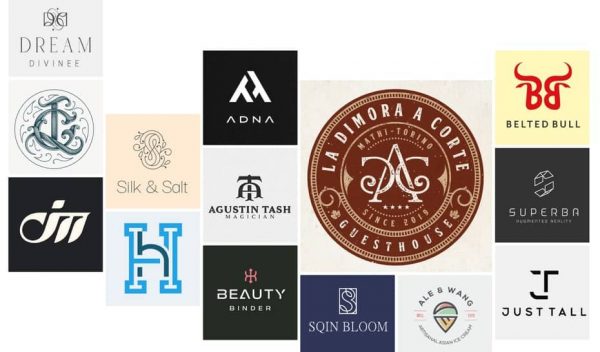
They say a picture is worth a thousand words, but how about a monogram logo consisting of only a few letters? Can it still tell as much story as other types of brand logos?
The short answer is yes! We have seen enough big brands with monogram logos that we know for sure, and they are just as powerful as any other type of logo.
However, there are few things that you should pay attention to while designing a monogram logo. Worry not, as we have summarized them just for you.

As monogram logos solely rely on typography, you have to be smart while choosing the right typeface. Choose the typeface that reflects your brand value. Moreover, you should ensure that your logo is versatile enough to stand out all across printed and online media. It is suggested that you go for sans serif or serif fonts as they have a cleaner look, making it easy for people to see and recognize your brand even from afar.
However, this rule shouldn’t stop you from trying to use script fonts for your monogram logo. General Electric is one example of a monogram logo that uses script font. Their logo was distinct enough that people could recognize it immediately despite the script font.
One of the main principles that you have to hold while designing a monogram logo is that less is more, which includes deciding the right color for the logo. Adding too much color to your design might cause the letters not to stand out enough for people to remember them. However, this doesn’t mean you can only choose one color for your design.
Be smart when you choose the color. Choose the ones that represent your brand best and incorporate them with the shape of the letters.
As monogram logos consisted only of letters, arranging them in a specific layout could add personality to your brand logo. The most common layout chosen by many brands is horizontal. Another way to orient your monogram logo is by displaying the letters vertically. A few examples of brands that do this are Volkswagen and Yves Saint Laurent.
Interlocked letters are also another creative way of arranging the letters. Chanel is one of the brands that do this very well. They simply arrange two C’s to interlock, yet the logo leaves a big impression to people that it has become one of the most famous monogram logos.
Adding a unique feature to a monogram brand logo is undeniably easier said than done. On the one hand, you don’t want to overcrowd your logo design as it should only consist of typography. On the other hand, you don’t want to make the design so plain that it’s forgettable.
However, it is still possible to make your monogram brand logo stand out without being too much. McDonald’s is one of many examples of how adding one unique feature can elevate the whole look of your monogram logo. Designer Jim Schindler managed to elevate the logo to another level by making the letter “M” the shape of golden arches reminiscent of french fries.
Those were the things that you should mind as you design a monogram brand logo. As you begin to design it, take a look at Pollux of Geminorum’s font library to find the perfect typeface for your monogram logo!