When we are talking about design, people will often focus more on layout, color, and images. Many people forget that typography is also an important element that can change the overall look of your design. Therefore, designers need to carefully think about the right fonts to use for their design.
We all know that there are many options to choose from. While it is nice to have options to choose from, having too many choices can be overwhelming instead. It will be more difficult to find the right one for your design. However, you don’t need to worry since this article is going to show you five hacks to choose the right fonts for your design.
Beginner designers often opt for one text box on a page and using the same typeface and spacing throughout the design. While it may look neat because it is uniform, it can also look boring and not capture your audience efficiently.
You will be able to make a difference by splitting the text into several boxes. Then, use a different typeface, size, and color to make your design looks more appealing.
When you are placing texts in your design, you also need to consider the alignment. Think about how the alignment suits the overall layout of your design. Usually, the options include left, center, and right alignment.
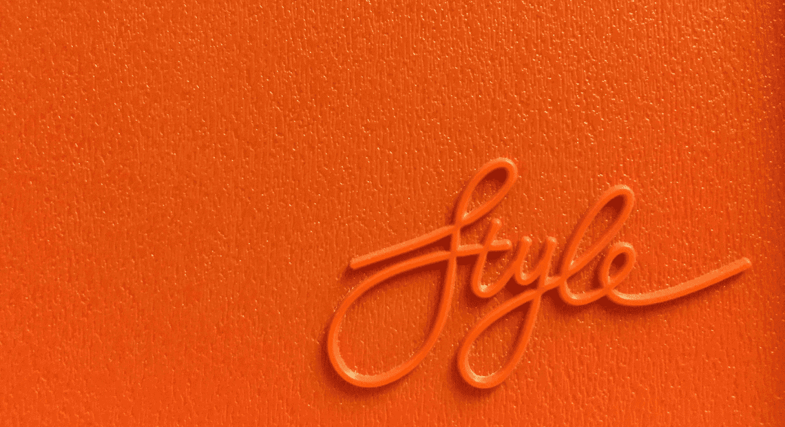
Different fonts offer different images or characters to a design. Therefore, it is important to carefully think about what kind of spirit or emotion your brand has. When you know what your brand wants to convey, you can select the appropriate font that can complement the message that the brand has.
A great example is how some beauty brands tend to use feminine script font while more masculine products use the geometric typeface. Using the appropriate typeface that matches the brand’s character will help you send the right message to the audience.
Another important thing that you should remember in choosing fonts for your design is to make sure that they are easy to read. While calligraphic or display typeface can look great, it won’t be easy to read in a body of a text.
You can use a more elaborate typeface as a headline to make it looks attractive. Meanwhile, you can opt for typefaces that are easier to the eyes and easier to read for the body text.
Last but not least, don’t be afraid to experiment with typefaces, especially if you’re just starting. You can try using all caps, different typefaces, different styles, and so on.
Fonts are an important part of every design, no matter what the purposes are. You may need a few attempts before finally can choose what type of font looks perfect for your design purposes. The abundance of font selection can be overwhelming and make it even more difficult to choose. However, with a few experiments, you will know what kind of typeface to use.
