There is no big company that doesn’t have a well-designed logo. That’s why a logo is always present as the top priority in a company’s branding project. Then, another thing that makes company logos so essential for a business is that they help build an impression of a brand. A logo becomes the first introduction that catches customers’ attention, providing them a glimpse of information about the brand’s niche or else.
On the other hand, company logos will become more significant for branding if we consider how long people’s attention span is. According to data released by Microsoft in 2000, the time span for someone to focus on something only lasts for 12 seconds. With such a short period, only a remarkable logo will make a company different from its competitors. No wonder that many people think a logo is a foundation for building the solid identity of a brand.

Considering that company logos are so requisite in branding design, we’ve gathered this helpful information for you. From what-to-do tips to brand logo inspiration, find everything designers need to know about creating a logo design below.
If the business is like a dating application, the logo is the picture you put on your profile. People will certainly see that as a reference to determine whether you are attractive or not. If the profile manages to capture their attention, people will desire to become more acquainted with you. The same concept applies to the brand logo as well.
Aside from that, a logo will also become a powerful communication tool you can attach to various branding purposes. You can put it on product packaging, websites, business cards, or even your annual reports. In short, a logo is a design element that customers or stakeholders always recognize first when reaching your brand. So, giving it a spectacular design is mandatory.
Thank you for reading this post, don't forget to subscribe!
A supreme logo can communicate the personality of a brand appropriately. So, before designing a company logo, designers need to identify the core personality of their brand. Then consider the following questions to help you complete the picture of what a designer needs to create a striking logo.
The next step is to start brainstorming your design ideas for the company logos. Honestly, this is always the toughest stage in the design process. Without a doubt, finding inspiration is not easy and requires patience. For that reason, try bringing out the best in your creativity by following the rules below.
Once you’ve got a clearer idea of your brand’s personality, it’s time to think about the design elements. From typefaces to colors, there are many graphic elements you need to harmonize in creating company logos. Therefore, make sure to choose a design aesthetic that matches your brand.
For example, you should pick the classic style to highlight the elegant impression of a brand. Alternatively, go for a retro design style to build a more esthetically pleasing look. Meanwhile, modern style will be a better option for brands that highlight a freshly youthful image.
Give thought to the type of logo that matches your company’s personality. Pick the right combination to communicate the brand optimally. The following are common types of logos you’ll find in the design.
With its streamlined look, a monogram logo is perfect for brands with a very long name or ones that have a hard-to-say spelling.
If your company has a cool, memorable name, wordmarks won’t go wrong for your design. Basically, wordmarks will lead you to put your brand name as a logo.
One of the most memorable logo symbols comes from Apple. People must immediately recognize the brand invented by Steve Jobs when they saw the logo. Although it seems simple, making this kind of logo design is not easy. Creating an iconographic image requires thoughtfully brainstorm. Hence, it’s not surprising that most company logos prefer to combine a logo symbol with a wordmark for more satisfying results.
This type of logo will be a fun way to make your company feel more approachable and friendly. Mascot displays cartoonish characters that can pull off the brand’s personality.
Each color carries an emotion associated with them. Accordingly, we must understand the psychology behind each color to decide which one is right to apply to the logo. For featuring a touch of passion and excitement, for instance, red is a perfect choice. Meanwhile, blue—one of the popular colors in logo designs—can build an impression of calming and trustworthiness.
There are four basics types of fonts you can use to create typographic designs for your logo. The first type is a serif font, which brings a bit of an old-fashioned and elegant feel. Then, there is a sans-serif font that leans more towards a modern, streamlined impression. The font gives a simple, clean look, so it is more suitable for modern brands.
Next, the script font brings out a calligraphic mood to your design. Its hand-written typeface makes a logo look more personal and aesthetic. The last one is a display font or usually called decorative font. As the name suggests, display fonts help you style up your design and make it look more dazzling. In addition, combining different fonts is widely implemented to create more powerful typography. However, make sure the combination can complement each other.
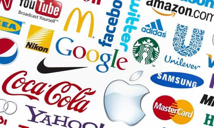
When it comes to creating company logos, many elements play a role, such as patterns, layouts, colors, typography, and many more. These ten (10) companies have succeeded in blending design elements and catch worldwide attention with their adorable logos. On the grounds of this, try learning about what uniqueness they have and get inspired.

Previously used the name of Goldstar Electronics, LG rebranded itself in 1995. To set a new face for LG, the company has changed its original logo to the one you see now. With just a simple shape and two letters, LG can make themselves instantly distinguishable from their competitors. While letters of LG support their slogan “Life’s Good,” the red circle on the background conveys the impression of fellowship and durability.

The original logo of Apple is certainly different from the one we see today. The brand’s logo changed to a bitten apple in 1977. After that, not many adjustments were made to Apple’s new logo. In addition to color gradations and embossed effects given to the design, Apple is quite consistent in showing its iconic logo. However, simplicity still becomes the key to Apple’s unique logo. Interestingly, Rob Janoff, who designed this phenomenal logo, admitted that he did it—giving a bite mark—to make the logo not resemble a cherry.

Google is one of the most recognizable company logos in the world. Maximizing the use of fonts and colors, Google managed to make their wordmark style logo seem everlasting. On the other hand, the space between each letter also plays a big role in the legibility of the logo. It even helps provide contrast to the letter so that they can shine out their own charm.

Toyota chose red to color their typeface. The reason is, of course, the same as LG—which also uses red as the primary brand color because it represents longevity and community. Meanwhile, metallic colors on its oval shapes reflect professionalism, dependability, and high quality. In spite of showcasing simplicity in its design, Toyota incorporates a deep philosophy into its logo. For example, the oval shapes in the logo are said to be a depiction of the company and customer’s heart combination. From this logo, we can also conclude that contrast gives a charming finishing—If we did it precisely.

Mercedes’ three prongs are very striking and offer a deep philosophy behind them. They actually express the earth elements: sea, land, and air. The magnetism of this logo also lies in its typeface. Mercedes’s slim, curved lettering gives the brand a more luxurious image. Because of that, if you choose a typeface, make sure it matches the personality your brand wants to show to the customers.

In line with Google, FedEx also devotes its logo to wordmark style. When it was first released, the original logo of this company featured a patterned blue color. However, FedEx later changed the typeface and color of its logo to what it is today. Apart from having powerful typography, color is the most prominent element in FedEx’s logo. While purple tends to represent luxury and an eclectic feel, orange is recognized as an invigorating and cheerful tone.

Originally known as Brad’s Drink, Pepsi is a drink company that also has an iconic logo. Actually, Pepsi has used all-capital sans serif fonts for quite a long time—since 1962. Then, the world’s cola leader decided to change its logo design to give a fresher look to the customers. Featuring a 3D flat globe, the Pepsi font seems thinner and more futuristic. Gerard Huerta is a designer who made Pepsi custom fonts.

Fonts and colors are the main strengths of the Coca-Cola logo too. Believing in the energy of red, this brand always seems playful and vibrant. Coca-Cola also proves that custom fonts are the key to creating eye-catching company logos. How their font can really describe the personality of the brand is something that makes the Coca-Cola logo so memorable and timeless. Reflecting on what Coca-Cola did with its logo, the right blend of shapes, letters, and fonts can create a truly unique design.

IBM has been known for its eight-bar logo designed by Paul Rand. Compared to its original logo—which uses a globe shape, today’s design is more able to give the impression of superiority as well as confidence. On the other hand, the simple lettering applied to the logo makes everything look solid. The use of serif fonts in the typography helps the brand to form a sophisticated and high-quality image.

The mollusk symbol and font become Shell’s charm to make its logo more recognizable. However, why does an oil company put a shell in its logo? In fact, before running the oil business, Shell focused on trading seashells. Bringing up contrasts like that can also be a brilliant idea to attract people’s attention. Additionally, its primary brand colors (red and yellow) can distinguish Shell’s personality from other oil companies.
Without a doubt, brainstorming ideas of company logos cannot be completed in just one night. Hence, take your time to consider the combination of each design element and make sure not to overboard it. For that reason, ensure to have a complete and reliable graphic arsenal. Visit the official website of pollux of geminorum to find some tips and products you need to perfect your logo project. Furthermore, the four basic font types are available on the website, which you can choose according to your design needs.

