Enjoy 25% Off All Fonts. Use Coupon Code ENDYEAR25 before December 31, 2025.

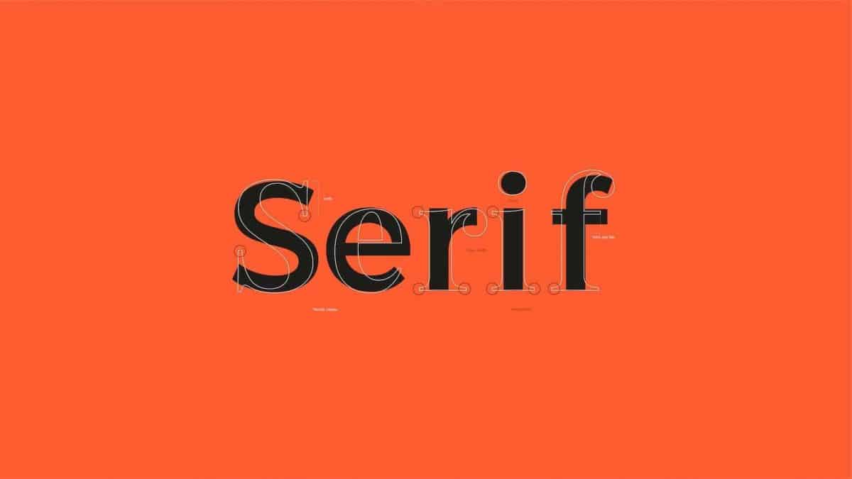
Do you know that serif font has many types of classification, and each has a different purpose? Serif font is a type of font that has been widely used for a long time. Times New Roman is arguably the most famous serif font.
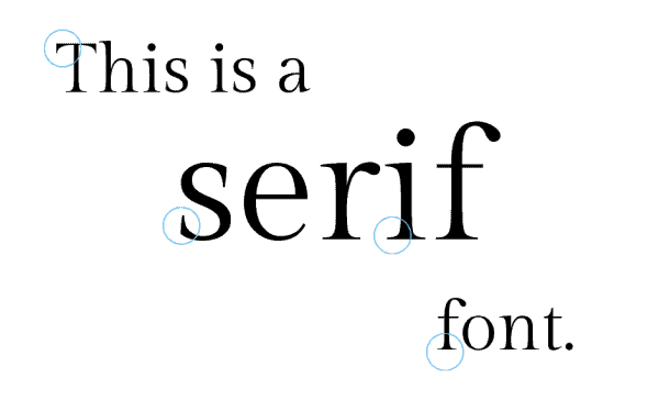
The particular characterization of the serif font is the serif itself, which is found at the edge of each alphabet. In this article, you will find several traditional classifications of serif font such as the old-style, didone, transitional, to the more modern ones like slab, rounded, and condensed serif.

The different types of serif font are classified mainly by the practical use of each type. However, some of them may have historical context. Here are the seven classifications of serif.
Old-style serifs have a calligraphic or drawn look to them. Do you recall Garamond? The serifs appearing in its lower case “d” should be noted. In contrast to Transitionals, which are more upright, old-style typefaces often contain diagonal stress.
Didones are known for their tiny serifs and high contrast. The term “contrast” is attributed to the idea that few of the lines are rather thin and are juxtaposed with quite heavy lines. The uppercase “N” in this situation is an excellent illustration. Take note of hairline serifs, which are quite tiny.
Transitional typefaces are typically seen as a bridge between the old and new styles, such as the Didones. Because serif fonts are so widely used, you’re probably already familiar with them. Transitional fonts include Times New Roman, Baskerville, and Georgia, which are all widely used. Take note of how the serifs continue to taper.
If you are curious about where the name “hairline” comes from, it actually refers to the font’s width itself. In other words, hairline serif is a particularly thin serif font. Hairline serif is originally inspired by the Didone serif type classification.
Just like how it sounds, slab serifs have a quite similar appearance. In fact, there’s no difference to it at all. The slab serif is characterized by consistent line width and thick serifs, which can be seen in each type. In modern design, slab serif is very popular as it is used frequently for logos, titles, headlines, and various other things.
For those who are in love with everything aesthetic, rounded serif fonts are made for you. Rounded serif has a retro vibe in it, reminding you of 1970s design with all of its classic feelings. If the traditional serif has a defined and well-cut edge, this type has a long and visible serif with a rounded edge. It makes the final result look old-fashioned but timeless.
“Condensed” and “serif font” are probably two terms that you will see in a sentence many times. It is because serif typefaces are sometimes referred to as condensed. Condensed is a font type with a smaller width and larger height, to the point that it becomes a prominent visual feature of the typeface’s design.
Serif font is an epitome of simplicity and classicism. Check out more fonts collection on Pollux of Geminorum, where you can also find many useful design tips for different purposes.