Let’s take a look at some famous brand names and logos: Mercedes-Benz, Tiffany & Co., GAP, and Rolex. What do you think they have in common? Yes, they use serif fonts as their logo designs – hence serif logos.
So, what is a serif font? Read through the following article to know better about one of the two most prominent font categories. You will also learn about serif font pros and cons, as well as their several classic examples.

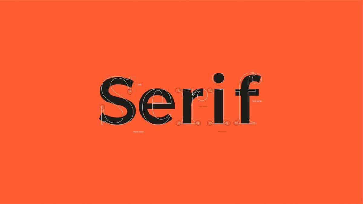
According to Natalie Downey, a Duckpin’s Senior Designer, serif fonts get their name from the “serif” attribute within the letters.
Serif is a decorative line (stroke or taper) that lengthens from the beginning to the end of a letter stem (bar or beam) in a typeface. As a result, it creates little horizontal and vertical planes within a word.
Serif font is, in a nutshell, a type of font that has decorative lines or strokes (people also commonly refer to them as “tails” or “feet” or the feet-like hooks).
Despite several exceptions, people widely associate serif fonts with impressions of “traditional, conservative, formal, elegant, and established”.
As we can date back serif typeface to the 18th century, companies that have used this font are widely seen as more traditional yet established and serious.
Printed works—books, newspapers, and magazines—are the main users of serif font since they are more legible (easy to read). This font is highly applicable to large bodies of text. They make letters not only distinctive but also easy for our brain to differentiate each letter.
However, if applied on a desktop, tablet, or mobile device, the font readability can be somewhat unclear due to typical screen resolution.
Fortunately, with advanced technology help, such as 4k screens and retina display, this type of font is increasingly more web-based readable.
Some of the most frequently applied serif fonts are Times New Roman, Georgia, Garamond, Courier New, and Baskerville.
Greatly used in books, magazines, and newspapers, these types of font remind us of more classical and sophisticated themes like the ones in Old English and Roman scriptures.
Three other classic examples are as follows.
Created in 1949 by Herman Zapf, Palatina is an old type of serif font. Published by Linotype, it became popular as a pre-installed font later with Adobe and Apple licenses. This elegant font family offers twenty styles, including options for family packages.
Designed in 1996 by Zuzana Licko, Mrs Eaves is a transitional serif font, more commonly used for display contexts. You can find them in book titles and descriptions, conveying elegant and whimsical headings and messaging.
If you want an elegant and classy look to your sophisticated works, go for this Nimbus Roman No 9. Designed in 1987 by RW Studio, you may find this typeface quite similar to the Times New Roman since it conveys a similar general tone.
As previously stated, serif typefaces are a perfect choice for more traditional business efforts, such as financial firms, legal practices, or insurance companies. They are also impeccable for more corporate-leaning purposes like marketing brochures or requests for proposals (RFPs). For that reason, if you want a more traditional yet established look and feel to your designs, you can go for serif fonts.
