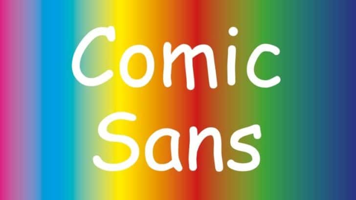
Out of many available fonts today, Comic Sans font is probably one of the most notorious examples because of several less than stellar reasons. So much so, it is highly not advised to use Comic Sans except for some very particular needs. Why is it that way? Why are we not allowed to use Comic …
How to Choose the Best Font for Your Video Subtitle
A video subtitle should be easy to read, comfortable to look at, and not obstructive. To achieve these criteria, choosing the best font for the subtitle requires several steps to avoid discomfort when viewing the video. Since there is no particular “standard” of video subtitle fonts, the only thing left to do is the ways …
25 Font and Typography Lessons from Billboard’s Best Album Covers
Album covers are often as iconic as the music, combining images and fonts to create unique artworks. Billboard acknowledges this by making the list of 50 best album covers of all time. From legendary icons to contemporary artists, they offer precious lessons for designers anywhere. Fonts are special because people often dismiss their roles in …
Serif vs Sans Serif Font: The Essential Guide to Understanding Typeface
While there is discussion among print and online designers about what makes a good typeface for a project, the matter is complicated because many criteria are used to this judgment. In many cases, the discussion reduces to a single question: serif or sans serif font? It can be a complicated endeavor to know how to …