
Typeface selection is as simple as clicking a name in a list. However, this choice is among the most important in the design process, including software design. Unfortunately, it is often overlooked.
Those who work in typography devote their lives to creating letterforms. Experts blend aspects like sentiment and balance, individuality and pragmatism, readability, and adaptability in very few forms. There are several factors to consider when choosing a font for a certain design.
When it comes to print design, typography has always been a primary focus for graphic artists. As the designer’s work has expanded to encompass all forms of digital media, typography has become a more daunting task. Take advantage of the web typography suggestions below when picking a font and arranging it for the greatest reading possible experience.
Before we go into the intricacies, let us first recap what typography is and why it’s so important to design.
Typography, which dates back to ancient times, is all about employing fonts and typefaces to make the material readable, clear, and fun to read. In typography, the look and structure of fonts are used to evoke a certain emotional response from the reader and transmit a specific message to the audience. The UI designer is also responsible for ensuring that the typeface complements the overall website design or app and that the typography is easy to read.
Thank you for reading this post, don't forget to subscribe!
If you want your users to identify a typeface with your business, you need strong typography. It can also affect decision-making by watching how people process and interpret the information provided by text, and it can retain the interest of your readers by being unique.
Let’s have a look at some of the basics of typography before we get started:
When discussing typefaces, the term “font” refers to the many weights and widths that make up a typeface. Three basic types of typefaces are serifs, sans-serifs, and ornamental typefaces.
Keeping your fonts constant is the best way to minimize misunderstandings. To assist your readers in quickly grasping what they’re reading, stick to a consistent font type.
White space, often known as ‘negative space,’ is the area surrounding text or visuals. Utilization of white space might go undetected by the users, but it guarantees that the interface is free of clutter
Alignment is the act of integrating and constructing text, graphics, and pictures to guarantee that each piece has equal space, width, and spacing between each one.
Color is among the most fun aspects of type design. Brightness, hue, and intensity are three of the most important aspects of color. These three components must all be balanced to make the content visually appealing and accessible to persons with visual impairments.
In typography, creating a sense of hierarchy is essential. When it comes to typography, the goal is to make obvious distinctions between the most important bits of material that should be read first and the rest of the text.
Contrast, like hierarchy, is a useful tool for delivering the message you intend to get over to your audience.

Users’ behavior is rather predictable when it pertains to software design. An actual printed page will not change its form or appearance based on who is holding it; the colors and typography will remain the same. What a treat! Typography in the digital age is much more flexible. Various elements influence how type is presented on the screen, including:
Firstly, screen size. Responsive Design can adapt to any alterations in screen size that may occur. However, this means that typesetting may be performed in vain at times.
Secondly, screen resolution. The pixel density of a screen has a significant impact on the readability of text. Technology has made high-definition screens more widely available to the general public, but designers must consider those with outdated equipment.
Lastly, screen calibration. The brightness of the screen has a significant impact on how colors appear on display. The colors used in software design must be compatible with a wide range of screen resolutions.
Many aspects of typography go beyond the selection of a good typeface for your software design. Overlooking the value of well-designed typography might harm the user experience.
Users skim the page rather than reading it when they first visit a website or software. Clear hierarchy and clean fonts are vital for making a strong first impression on the user and retaining them on the website.
As soon as you get your audience’s attention, the issue shifts to presenting the necessary information. User Interface (UI) designers have an important role in ensuring that typefaces are used to enhance rather than detract from the message.
Typography serves as such adhesive that keeps them together when all of the other interface parts are in harmony. Set the general attitude of the business, working cooperatively with the other graphics to produce an overall visual balance.

To avoid losing potential customers and users, it’s important to pay attention to typography when designing a new software product. We’ve spotlighted several of the most common typographic blunders that developers should be aware of.
This space defines line breaks. Reading is becoming more and more exciting when the eyes can rest between lines. As a general rule, try to use at least 2 points larger than the type size.
Additionally, extreme line height makes it more difficult for readers to get the next line, a common readability problem that many designers encounter. Newspapers and periodicals may be a good source of inspiration for reducing the number of lines in your text.
You might think of the spacing between words in a word or a sentence as “tracking.” The more area there is for the letters to make up a word, the greater the tracking.
Tracking is normally adjusted to match the typeface’s line length, but introducing too much tracking will reduce the legibility of the material, so it’s best to keep it to a minimum.
If you’re working with typography on the web, alignment is critical. Text is easier to read in chunks on small displays because the human brain processes information sequentially. As a result of the text being left-aligned, the right-hand side of the blocks typically has an uneven edge.
In addition to contrast, typography may have an impact on how well it reads. Having too little distinction between both the content and the backdrop might make it difficult to read.
The same holds for excessive contrasts and many styles on the same page. Since there are so many design styles on the same page, it appears amateurish and makes it hard to read. To avoid this, make use of a single typeface and two saturating options at all times.
When creating for a certain brand, typography standards specify the typefaces and maintain the fonts constant. However, many designers forget to execute it. Without proper typographic rules, it is impossible to define the precise size, spacing, consistency, and use of the typeface.
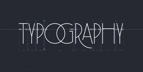
Key crucial elements for incorporating font into your software design are written out here. Use these as references as you start off. There are two primary aspects of typography in UI design that we’ll cover: readability and scalability.
A lot goes into picking the right typeface for your business, including the personality of the product or service, the demographic it is aimed at, and the product or service’s value. Font selection is not a decision that can be made in a matter of seconds because there is an unlimited number of fonts to choose from.
It’s tempting to employ numerous fonts in a single component, but the user may find it difficult to distinguish between the varying styles. If you’re just getting started with font matching and typography, stick to typefaces from the same family or one typeface. Sticking to a single typeface can offer your interface a more coherent appearance because fonts out of the same typeface are designed to operate together.
Finally, you must confirm that your typefaces are compatible with online browsers. If you’re looking for a simple way to get your hands on online fonts, Google Fonts is an excellent option.
Below are some tips for nailing your software design typography:
Typographic layouts are incomplete without the proper hierarchy. Because it shows the reader where to start reading or where to go from there, readers and viewers will have an easier time following by simply presenting a contrast to important diverse material.
In addition, a key consideration is the weight placed on certain content pieces. You’ll be able to do this by putting links in bold and showing quotes.
Web typography, as previously said, needs attention points. These things are highlighted so that the user may focus on them. These points and items help to break up a monotonous piece of writing.
Since the first word that an audience takes is the headlines, no matter how useful the content is, it won’t matter if it lacks a solid header.
Starting with the header’s size, it’s equally important to pay attention to the body text’s size. As a result, the reader may become disoriented and lose concentration while reading if the header contains too much information.
A user-friendly header, bold assertions, and a term with high search traffic are the best strategies to make custom and engaging headlines.
Negative or white space refers to the area around words or images. It is important to employ white space in the right way to guarantee that your design seems clean and ordered.
Content may be drawn to and enhanced by white space, which may also enhance the visual appeal of the entire page. The amount of white space you employ has a significant impact on both the process and the outcome.
The number of words per square inch is referred to as “text density.” Your article’s readability depends heavily on its content density. Line size, letter width, and text size all have an impact on the density.
Here, it would be best to strike the right balance between these factors so that the material is neither too compacted nor too distributed so that the density is clear and scannable.
The art of software design is indeed a difficult one to master—only a few typefaces were available for use on computer monitors not so long ago.
The number of fonts available to us has increased by leaps and bounds—the screen has been built with special features that make them easier to read. And so, printed typefaces fool the eye to boost readability on the web.
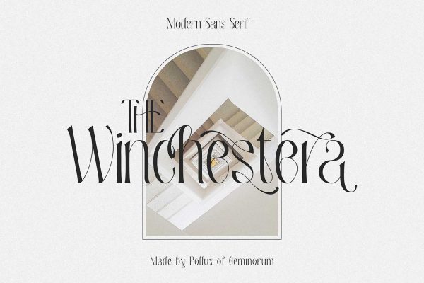
The Winchestra is another excellent choice for software design fonts. If you’re looking for an eye-catching serif font, the Winchestra is an excellent choice. This font can be read at any size because of its good scalability. The millennial generation prefers this brash and energetic typeface.

The Bravery is a geometric sans-serif with open curves in the serif family. In both business and personal contexts, it is regarded as a pleasant and professional type of typeface.

Golivia is a feminine sans-serif typeface with an attractive, contemporary feel. Websites having a female audience should use this type of typeface. As the font’s weight decreases, the more visually beautiful it becomes.

To create a striking headline, Richard Benoit was created as a display typeface. Whatever the weight, it retains the classy feel that is appropriate for any company taking itself professionally. Luxury companies are known for their ability to achieve a delicate balance between elegance and minimalism.
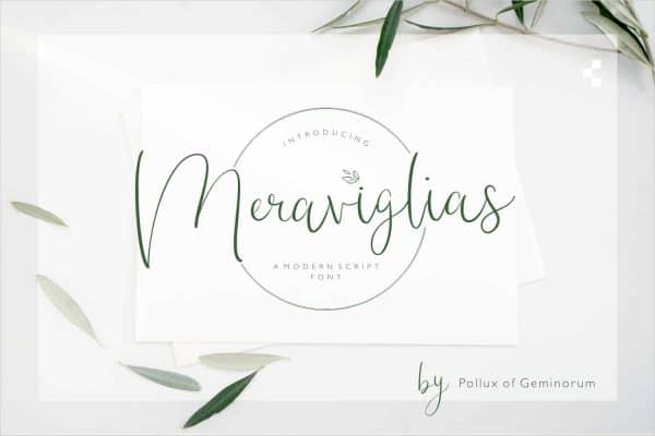
In terms of readability and style, Meraviglias is a great font option. Among the top fonts for UX and readability, this display font is among the best. Meraviglias is a good choice for most users and is best suited to enterprises with high importance on quality control and stability.
After knowing the best practices and common mistakes to avoid when designing for software, now you’re ready to go out and create your software design using the typeface recommendations we put above. So, what are you waiting for? Check out our font selection and start designing!