When you happen to attentively look at the typeface of some famous company logos, there must be a possibility of you conjuring up a question, “What kind of font did they use?” This article is definitely made to answer that query. We will look at five different fonts widely used in the logos of renowned companies in the world.
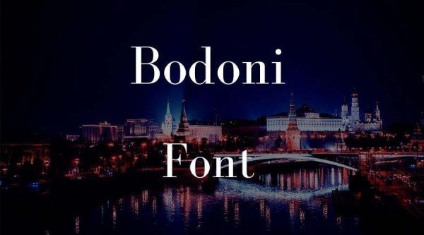
Bodoni was first introduced in the 18th century by Giambattista Bodoni—a well-known publisher and typographer originally from Italia. The font appears dramatic and somewhat contrasting, for it features both thin and thick lines.
Bodoni also comes with a perpendicular serif typeface that is adequately strong, making it suitable for brands to convey their art-related expression. No wonder that Nirvana and Vogue selected this font for the design of their logos. In addition to this, Bodoni also appeared on the Mamma Mia posters.
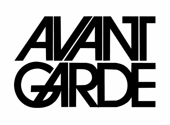
Adidas and Calvin Klein are known as high-end fashion brands. While they are both different in terms of their business nature, the two basically share the same design element in their company logos. They employ Avant Garde font, which was created by Herb Lubalin for their logo design.
The font is most likely to be featured in headlines or shortline articles in addition to being employed by the two fashion brands above. This sans-serif typeface is chosen for the logo because of the fantastic fearsome look it delivers it.
Thank you for reading this post, don't forget to subscribe!

Designed by Paul Renner in 1928, Futura is deemed one of the most influential fonts in graphic design. This geometric sans-serif typeface is known for its simple, sleek, and modern look. It also supports high legibility on various mediums.
Futura appears on popular brandings, such as Nike, Dolce & Gabbana, Paypal, and many more. Why this font? Nike, for instance, the bold version of font represents strength, and its geometry depicts the stability of Nike as a strong brand.
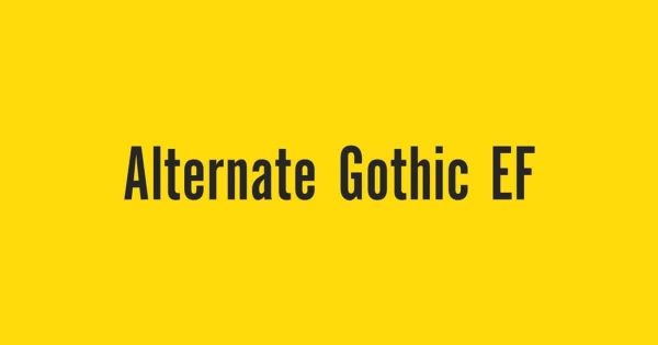
This bold and tight font was introduced in 1903 by Morris Fuller Benton as a counterpart to Franklin Gothic. It’s a font with a relatively long history, created to be ideal for inserting titles in limited space. It is distinguished by its stretched height and narrower width.
The YouTube logo incorporated the font into their design until the company rebranded it in 2017. Since then, this giant video platform has employed its own custom font known as YouTube Sans. Alternate Gothic can make a significant consideration to convey a strong brand through company logos.
It’s not a familiar type of font, to say the least, even for some designers. There are no actual studies of agencies or even designers that have worked explicitly with them. However, this grotesque sans-serif typeface can be easily located in the logo design of Linkedin.
Akzidenz-Grotesk can be identified for its geometric shapes that are relatively flexible and natural. The font was chosen by Linkedin because it can deliver a sense of professionalism and deference. This is precisely what a professional social platform like Linkedin would like to convey.
The more prominent brands are more likely to prefer fonts with a distinctive style for designing their company logos. Thus, some of them may significantly alter the font from its earlier version. Pollux of Geminorum offers fonts in which some of them are tweaked from the original form of the fonts above.