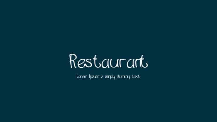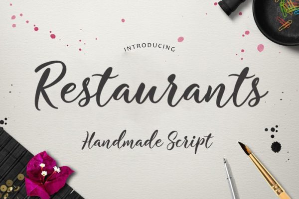
When it comes to design projects for an establishment, menu design is crucial. It must represent the restaurant’s character and communicate its range of dishes. It suggests that choosing the right font is essential. One restaurant font type alone won’t suffice, but combining two to three from the list below may enable you to produce stunning menus.

Didot is a sleek font with delicate lines that works excellently with complex delicacies prepared with meticulous attention to detail. Its fine strokes can direct the reader’s attention to what’s on the board.
With broad stems, this serif typeface appears to be robust and powerful. The expensive look the font offers makes it ideal to be used in a high-end eatery. You may use this font to draw attention to your restaurant’s most sophisticated dishes.
Helvetica is impossible to dislike. It’s an exquisite, subtle font that allows any menu to speak independently. However, it will also work well with any font in the serif category should you add a bit of an impact.
This font features a solid character set with a wide range of condensed shapes. One can never go wrong with this one restaurant font. Its simplicity enables the reader to pay attention to the menu’s displayed immediately.
Thank you for reading this post, don't forget to subscribe!
Baskerville is a font that has been around for more than two decades. This timeless serif typeface features rounded forms and classic font symbols. It also has a higher x-height, lower contrast, and more spacious counters.
This font’s features make the font perfect to be displayed on any screen with small-sized text. Some might regard it as a restaurant font only, but its versatility proves otherwise. It will look just as perfect in a high-end restaurant as it will in a low-end bar with an old-school vibe.
Open sans is a font that falls under the category of sans serif. It consists of various character sets, making this font can be used in many languages. Its neutral and amicable look offers higher legibility in publishing or printing formats.
If it’s employed to design a menu, it can help convey a message that the place is pleasant and warm. The font also can communicate to the guests that the establishment has a wide variety of high-quality dishes.
This transitional serif typeface is the basis of Times New Roman. It comes in four forms: regular, bold, bold-italic, and italic, making Plantin one of the most versatile fonts that are sleek, classic, and legible.
It has a condensed structure that makes it an efficient font. Plantin can be implemented in various settings, including periodicals, book publishing, and many more. If utilized in menu design, it can create a clear design with high legibility.
The listed fonts above can be your option to design a menu. All the fonts are designed in a certain way that can work effectively in the foodservice industry. Should you want to have another option of a restaurant font, consider checking out Pollux of Geminorum—a platform for all your typography needs.