Who says that text-heavy logos cannot express creativity? Many corporate fonts are used as logos in clever ways. Good designers even manage to insert extra creativity and add value to the company message in the logo. Many famous text-based logos are known for unique “secret” messages in their designs, adding dimension to the corporate branding and vision.

Need to be inspired? Here are unique typography secrets in seven famous companies and brands.
Baskin Robbins is known for its bright blue and pink “BR” logo, which draws consumers because of its playful, stylish look. However, the “BR” is more than just initial. Since Baskin Robbins boasts 31 flavors, the letters also hide the numbers 31 in them, which you can see from the pink highlight between the blue parts.
Aside from the full name, London Symphony Orchestra is featured using its modern logo. At first glance, the logo looks like the casual version of the letters LSO, written as a calligraphic script. However, the lining style of the LSO also forms the simplistic silhouette of an orchestra conductor holding up a baton. The calligraphic script and modern image combination add a unique flavor to the text-based logo.
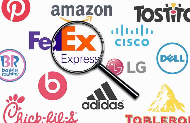
One of the most famous uses of iconic corporate fonts, FedEx, is bold and straightforward yet keeps a secret. The simple sans serif font and bold colors make it easy to see on planes and trucks. However, the negative space between the “E” and “X” forms a white arrow. This subtle arrow reflects the company’s commitment to precision and speed.
The iconic Sony Vaio logo has become commonplace in computer stores worldwide since its inauguration in 2014. However, not everyone knows the meaning of its notable text-based logo. The curved “V” and “A” represent the analog wave, while the “I” and “O” symbolize the binary code of the digital signal. Together, they represent Vaio’s tech integration between analog and digital.
Another creative use of seemingly standard corporate font, the Gillette logo, uses a common sans serif font with italic style. The straight lines and sharp edges add the perfect vibe for its razor products. However, if you look carefully, the diagonal cuts on the “G” and “I” look like they were slashed with a razor. This subtle addition hammers the subliminal message even harder into consumers’ minds.
Despite being an upscale department store, Galeries Lafayette dares to use script font with brush effect, often not associated with such business. The seemingly simple text-based logo actually hides a secret behind its “f”. Take a look, and you will see a rough silhouette of an Eiffel Tower, an iconic symbol of France that reflects the department store’s origin.
Dell probably looks like a typical text-based logo with a standard corporate font for you. However, there is a hidden secret in the shape of the “E”. The skewed letter was inspired by the founder’s philosophy, Michael Dell, who aimed to “turn the world on its ear” with innovations. The skewed “E” reflects the world-turning philosophy.
Are you interested in creating text-based logos like these companies? Find your corporate font at a creative source like Pollux of Geminorum and get inspired to create meaningful logos.
