Those who work in the graphic design industry combine more than one object to produce a communicative product. Using the help of images, colors, and other visual elements, designers can communicate the intended purpose through their design.
However, the text can be the last nail in the coffin for a well-crafted design. While visual objects might help establish a refined visual context, belittling the use of fonts can be the most severe error in any design asset. There is a wide array of great fonts, and below are some of the must-have ones for every designer.

Gotham was first released in 2000 by American professional designers Jonathan Hoefler and Tobias Frere-Jones. They aimed to design a font that is professional, modern, and clean. They’ve effectively delivered their goals in the form of the Gotham typeface.
Gotham is a geometric font that is a perfect example of American graphic design style. It’s ideal for large headers and titles. It also works well in digital and print platforms and is widely used among web and print poster designers.

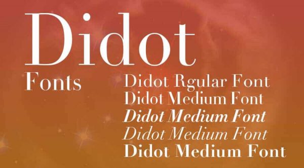
Didot is a serif typeface that was redesigned by Adrian Frutiger and released in 1991. For it’s redesigned based on the original version of Didot, it’s unquestionable for this font to be regarded as one of the most fashionable fonts available today.
Thank you for reading this post, don't forget to subscribe!
The font is known for its stroke contrast, vertical stress, flat serif, and armature. The said attributes make this fashionable font ideal for large headers or titles. The Didot font can be a great selection if you want your design layout to appear more exquisite and opulent.

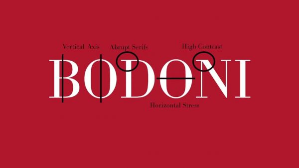
Didot typeface inspired Giambattista Bodoni to create his own font named after him. The original Bodoni was released in 1798 but redesigned by Morris Fuller Benton in 1911 and is now commercially introduced by Linotype.
Compared to its predecessor, Bodoni appears to be more compressed and extravagant. This stylish typeface features high contrast and contemporary serifs. Its geometric style and unbracketed serifs have made it a popular option for designing titles and logos.

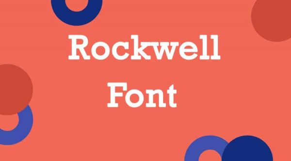
Introduced initially as Litho Antique, Rockwell is a geometric slab serif typeface that is popularly known to be highly recognizable, primarily when used for graphic design products.
Rockwell is one of the geometric slab serif fonts with practically no curves and only features sharp angles and precise circles. Its width and height make this font can provide a powerful presence. It’s sufficient for all design needs, particularly for headlines on digital or printed displays.

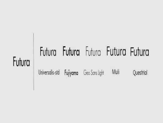
Futura is a sans serif typeface introduced in 1928 as part of Germany’s renowned Bauhaus movement. It has since been utilized by many designers across the world. It’s regarded as one of the most versatile fonts for it can be adjusted to any kind of design product.
Futura can suffice the needs of designers who want to get the most out of limited space. It can make a perfect pairing for establishing company fonts, adding texts to products, typing textbooks, and designing logos.
As previously mentioned, there is a wide variety of typefaces one can select for any design project. However, it can sometimes be difficult for a designer to choose which font suits their design needs.
The top five fonts discussed above are the prevalent ones in the graphic design industry. The list can help you figure out what type of font do you require. However, there’s always a time for one to need something distinctive for a typeface. Thus, consider checking out the Pollux of Geminorum site for some brand new fonts.