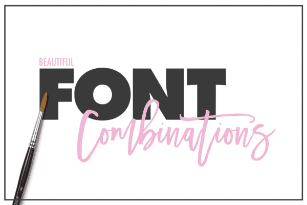
Every family of fonts have their special features, so do Sans Serif fonts. However, in real design projects, you can’t always stick to using the fonts from the same family—font combination is needed here and there. The best representations of typography are mostly developed from different fonts that can create a strong typographic connection. Here are some easy tips to do with the fonts from Sans Serif collection to achieve such a goal.

Combining two or more fonts from the same collection is not a wise decision. It is one of the first rules you should always remember in the context of font combination. By doing so, your project will pass up the chance to have distinctive elements—and as a result, the final design might turn just bland.
The right thing to do is find a perfect match for the typography. In this case, Serif is highly suitable for Sans Serif fonts; they work well together and can make any design look better. Try combining Serif’s old styles like Caslon and Garamond with contemporary Sans Serif such as Lucida Grande or Gill Sans to see a good example.
Weights refer to the thickness or thinness of letters. As you browse through the font collections, you will find that some fonts are slim and tall, while some others are stout and chunky. Such quality is actually good for your creativity because it allows you to combine different font weights for a perfect combination.
Sans Serif fonts tend to be lightweight, meaning that most of them come with skinny strokes and a few or no embellishments. Therefore, you need to combine them with some bold typefaces to present different roles as the main and supporting fonts in your design.
Thank you for reading this post, don't forget to subscribe!
Just like humans, fonts come with different moods and personalities. For the sake of good design, fonts with the same moods and characters should always go hand in hand. It would be best if you also remembered this rule when combining Sans Serif fonts with other styles of typefaces.
Most fonts in the Sans Serif family convey a sense of casualty while expressing simple and informal moods. That’s why you need to find the best complimentary typeface which can share the same atmospheres with your first choice of font.
As you come closer to finish your design project, the discussion is not about the fonts alone. You should also consider other features and elements; one of the most important ones is the colors.
You may feel that you have chosen the right font to complement different typefaces of Sans Serif. However, the combination of those fonts will not look as good without the correct choice of colors. The key is to create a contrast that can make each font stands out on their own. For instance, casual letterings like Sans Serif should be colored in bright, while its bold or strong pair can use some neutral shades like black.
Those are some simple tips and tricks to follow when you combine Sans Serif fonts with other styles of typefaces. Hopefully, they can clear up some confusion commonly faced by beginner designers regarding font combinations. If you are looking for ideas and inspiration about font selections and more, be sure to check out this excellent website.